Preview image. Unlock full-res
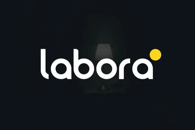
Labora wordmark set in bold geometric sans-serif with a single yellow circle accent positioned above the final letter, establishing a distinctive brand mark.
Summary
Labora wordmark set in bold geometric sans-serif with a single yellow circle accent positioned above the final letter, establishing a distinctive brand mark.
Visual description
White sans-serif typography spelling "labora" centered on a dark charcoal or near-black background. The typeface is bold, geometric, and contemporary with closed forms and consistent stroke weight. A bright yellow circle sits above and to the right of the final 'a', functioning as both a design accent and a tonal pop against the monochromatic palette. The wordmark leaves significant negative space around it, emphasizing simplicity and confidence. The background is clean with no additional imagery or texture.
Key takeaway
The minimal two-color approach (neutral + single bright accent) that creates instant visual hierarchy and memorability. The positioning of the accent dot as a floating element that reads as part of the mark rather than a standalone element. The choice of a highly legible, geometric sans-serif that conveys modernity and professionalism without ornamentation. The effective use of dark background to make white type appear crisp and bold.
Reuse notes
Strong template for technology, consulting, SaaS, or B2B brands targeting professional audiences. The high contrast ensures the mark reads clearly at any size or application. The accent dot technique works particularly well for companies seeking a distinctive, memorable identifier. Works equally well for digital (screens, light backgrounds) and print (dark backgrounds, business cards, signage).
More like this






Keep what you find
A free account saves references to boards and can send you a weekly email of picks based on what you save.
To see every result, go Pro.