Preview image. Unlock full-res
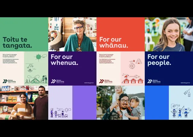
Community-focused identity for Western Bay of Plenty Council in New Zealand using Maori language, color-blocking panels, and photography to represent diverse community segments.
Summary
Identity system for a New Zealand council communicating four core values in Maori language through color-blocked panels, paired photography, and line illustrations with consistent logo placement.
Visual description
A 4x3 grid of branded panels organized in warm and cool color blocking. Top row: sage-green panel with Maori text "Toitu te tangata" (Stand by people), portrait photography of an older woman, bright coral panel saying "For our whanau" (family), and portrait of a girl. Lower sections show photography of diverse community members, line illustrations depicting nature and community scenes, and solid-color panels in purple, pale blue, and dark navy. A white double-arrow mark appears as the logo in each panel. Typography is set in clean sans-serif in white, cream, and dark navy.
Key takeaway
The structure of pairing bold color-blocking with authentic photography to honor each audience segment without feeling repetitive. The double-arrow logo design that works at different scales and colors. Using Maori language as primary signage (not secondary) to genuinely center indigenous voice rather than tokenize it.
Reuse notes
Excellent template for government, nonprofit, or community organizations in multicultural contexts. The color palette (warm coral, cool sage, navy, cream) accommodates photography while staying cohesive. Grid structure allows scaling to many values. Requires strong photography investment to avoid feeling generic.
More like this



Keep what you find
A free account saves references to boards and can send you a weekly email of picks based on what you save.
To see every result, go Pro.