Preview image. Unlock full-res
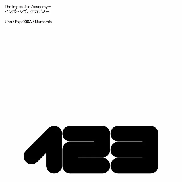
A typography specimen featuring geometric letterforms from the Impossible Academy typeface system, with the numeral 130 as the primary logo mark.
Summary
A typography specimen showing the Impossible Academy typeface system, with the geometric numeral 130 displayed prominently as the primary logo mark with cut-out letterforms.
Visual description
At the top, small black text reads The Impossible Academy™ with Japanese characters below. Below that is a secondary line: Uno / Exp 000A / Numerals. The main composition features a large bold black numeral 130 with geometric, rounded letterforms that use white negative space to create cut-out details within each digit. The forms feel both mechanical and humanistic.
Key takeaway
Using numerals as a logo mark rather than text creates an unexpected and memorable identity. The cut-out negative space within the forms adds sophistication and makes the mark visually distinctive. Geometric precision paired with subtle humanistic curves.
Reuse notes
Effective for tech, design, or educational institutions seeking a distinctive typographic identity. The numeric approach works well for experimental or forward-thinking brands. The typeface system flexibility allows it to scale across various applications.
More like this




Keep what you find
A free account saves references to boards and can send you a weekly email of picks based on what you save.
To see every result, go Pro.