Preview image. Unlock full-res
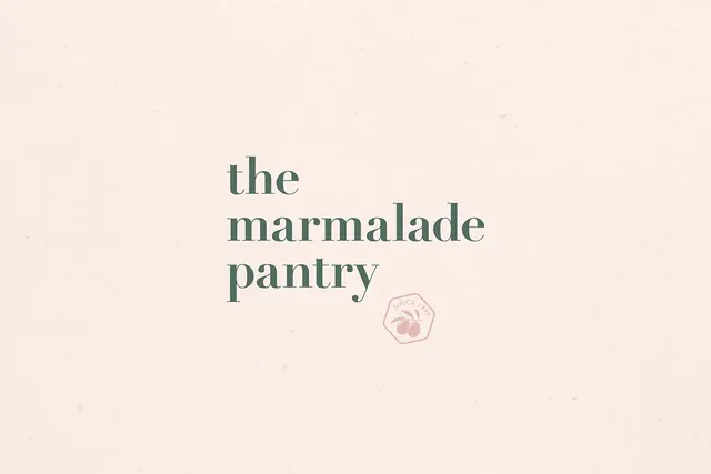
A minimalist food branding lockup combining "the marmalade pantry" in refined serif typography with a small hexagonal emblem featuring a fruit illustration and "SINCE 19XX" text.
Summary
A sophisticated food branding lockup pairing the wordmark "the marmalade pantry" in muted teal serif type with a small hexagonal emblem positioned below, containing an illustrated fruit motif and "SINCE 19XX" founding text.
Visual description
The brand name appears in a refined, lowercase serif typeface in muted teal-green against a warm cream-beige background. Positioned below and to the right sits a small hexagonal emblem in a light pink outline, containing a simplified illustration of berries or preserved fruit in the center. The text "SINCE 19XX" arcs around the top edge of the hexagon, establishing heritage and artisanal positioning.
Key takeaway
The hexagonal geometry echoes traditional jam jar lids and preserves packaging, while the delicate fruit illustration directly connects to the product category. The mix of refined typography with a playful geometric emblem balances sophistication with approachability.
Reuse notes
Ideal for artisanal food brands, particularly preserves, jams, and specialty pantry items targeting premium, heritage-conscious consumers. The hexagonal emblem is versatile for secondary mark applications, packaging, and labeling. The muted color palette works well on natural kraft paper and traditional packaging materials. The "SINCE" text can be customized for different heritage dates.
More like this


Keep what you find
A free account saves references to boards and can send you a weekly email of picks based on what you save.
To see every result, go Pro.