Preview image. Unlock full-res
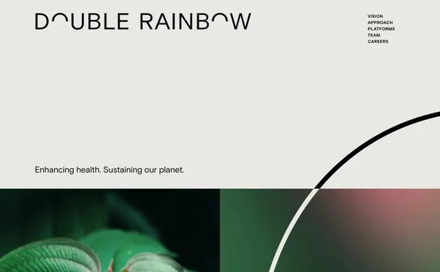
A clean, minimalist brand identity featuring a wide wordmark and a balanced layout with a nature-inspired visual element.
Summary
A clean, minimalist brand identity featuring a wide wordmark and a balanced layout with a nature-inspired visual element.
Visual description
The design features a wide sans-serif wordmark at the top left with a tagline below. A large, sweeping black arc cuts across the bottom right, framing a photographic image of a green leaf and a blurred red background.
Key takeaway
The use of ample white space and organic curves creates a sense of tranquility and environmental consciousness.
Reuse notes
Apply the wide-spaced typography and large arc element to headers and section dividers.
More like this



Keep what you find
A free account saves references to boards and can send you a weekly email of picks based on what you save.
To see every result, go Pro.