Preview image. Unlock full-res
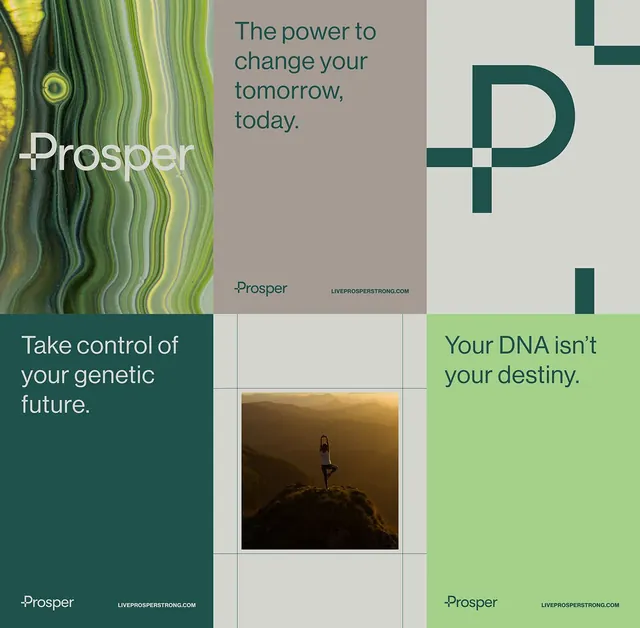
A cohesive brand identity for Prosper (genetic wellness) featuring a teal geometric logo mark, earthy sage-green color system, and a modular grid layout combining photography, copy, and typography.
Summary
A wellness brand for Prosper (genetic testing) combining a geometric teal logo mark, sage and olive green palette, and a 2x2 grid layout with landscape photography, copy blocks, and navigation.
Visual description
The layout spans four sections on a beige/gray field: top-left shows the wordmark "Prosper" (white sans-serif on a natural striped photograph). Top-center displays the brand promise ("The power to change your tomorrow, today.") in teal sans-serif text. Top-right presents a geometric teal "P" logo mark (a plus-cross overlaid with the letter). Bottom sections pair a dark teal block with white copy ("Take control of your genetic future.") against a bright sage-green block with white sans-serif ("Your DNA isn't your destiny."). A golden-hour landscape photograph of a woman on a mountainside anchors the center grid cell. Each section bears the Prosper mark and website URL.
Key takeaway
The restraint in using only teal and green (plus neutrals) to create a harmonious identity. The geometric plus-mark as both a design element and conceptual nod to wellness. The grid-based composition showing brand application across copy, photography, and mark, all in one compact view.
Reuse notes
Ideal for healthcare, wellness, and genetic/genomics brands seeking modern authority without clinical coldness. The earthy palette signals natural science and trustworthiness. Works well when the brand philosophy (empowerment, choice) can align with the geometric geometry. Requires high-quality landscape photography for the center placement to avoid feeling flat.
More like this







Keep what you find
A free account saves references to boards and can send you a weekly email of picks based on what you save.
To see every result, go Pro.