Preview image. Unlock full-res
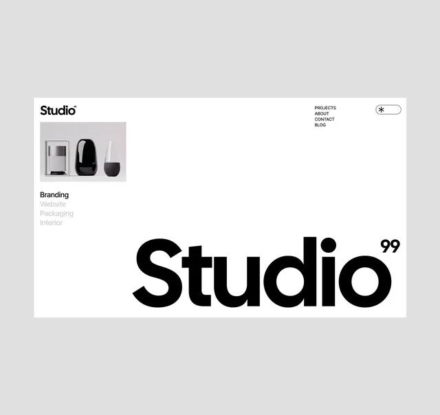
Monochromatic portfolio page featuring a compact logo and navigation in the header, a product photograph grid on the left, and a massive centered sans-serif headline reading 'Studio' 99.
Summary
Monochromatic studio portfolio hero combining a compact header (logo, navigation) and product photography on the left with an oversized typographic anchor reading "Studio" 99 that dominates the right half.
Visual description
A white canvas divided into left and right zones. Top left: a minimal logo reading "Studio" with a star or asterisk glyph, followed by a secondary nav listing Projects, About, Contact, Blog; a search icon appears top right. Below the nav on the left: a gray rectangular product photograph showing three sleek objects (a soap/product bottle in white, a black rounded form, and a transparent glass). Below the photo: hierarchy labels reading "Branding," "Website," "Packaging," "Interior" in black and light gray text. The right side of the page is almost entirely white space, interrupted by the enormous black sans-serif headline "Studio" 99 positioned centrally, where the numerals are smaller and offset. The overall effect is a study in negative space and typographic dominance.
Key takeaway
Using a single massive headline to anchor a minimum-detail page; pairing it with a small, well-composed product image on the opposite side for balance. The restraint of navigation and secondary copy creates a premium, gallery-like feel. The "99" gesture (possibly representing a year or edition) adds a subtle craft dimension without clutter.
Reuse notes
Excellent default for a design studio or high-end product brand where the work should speak louder than explanation. The monochrome approach photographs well and remains effective at all breakpoints. Not ideal for information-dense sites; requires confidence that visitors will dig into Projects/About on the secondary nav.
More like this

Keep what you find
A free account saves references to boards and can send you a weekly email of picks based on what you save.
To see every result, go Pro.