Preview image. Unlock full-res
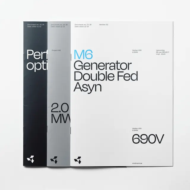
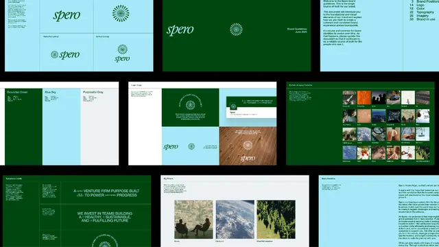
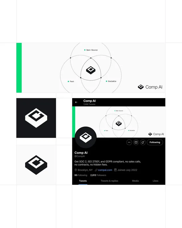
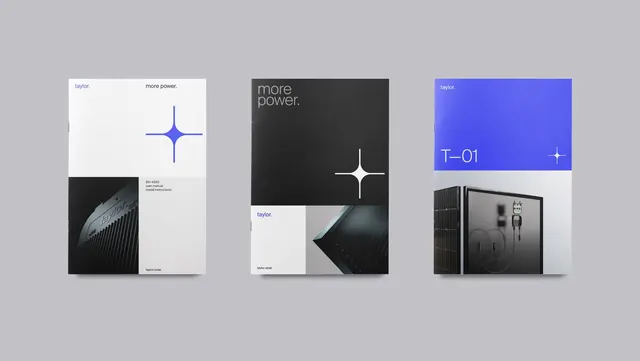
Powerhouse brand system featuring geometric grid patterns, deep forest green accents, and a compact square logomark paired with structured sans-serif wordmark.
Summary
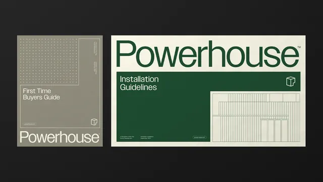
Powerhouse brand system shown across two collateral pieces: a beige "First Time Buyers Guide" cover with a dotted grid texture, and a green "Installation Guidelines" sheet with a vertical-line diagram.
Visual description
The Powerhouse system combines a compact square logomark (a small icon nested in the lower right corner) with a clean, extended sans-serif wordmark in deep forest green. The beige cover uses a quiet dot-grid pattern as a subtle texture, with left-aligned title and small icon. The green cover employs the same typography hierarchy and adds a minimalist line diagram filling the right side, reinforcing the technical, instructional nature of the content. The color palette is restrained: forest green, warm taupe, charcoal, and off-white create professional contrast. All elements are left-aligned, with generous whitespace defining the layout.
Key takeaway
The subtle dot-grid and line-diagram patterns add visual interest without becoming decorative. Pairing a tiny logomark with a substantial wordmark creates a clear visual hierarchy and allows the wordmark to be the primary identifier. The muted green-taupe-cream palette reads as trustworthy and technical without coldness. Left-aligned flush typography with ample margin creates clean, readable layouts.
Reuse notes
Ideal for technical brands, installation guides, product documentation, and engineering-focused companies. The forest green works well for sustainability and industrial products. The grid and line patterns are replicable as subtle textures on covers and headers. Best applied when content is instructional or structured; works across web and print.