Preview image. Unlock full-res
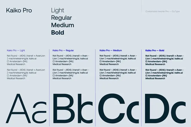
Kaiko Pro specimen layout demonstrates four weights (Light, Regular, Medium, Bold) in a vertically stacked grid with large alphabetic samples and detailed character references.
Summary
This specimen page for Kaiko Pro presents the typeface in four weights (Light through Bold) using aligned columns, sample text blocks, and large alphabet display to compare weight range and character metrics.
Visual description
The page uses a light blue-gray background with a vertical three-column grid. The left column lists the font name "Kaiko Pro" and four weights (Light, Regular, Medium, Bold). The middle columns show weights stacked vertically, each with two text blocks: a body-copy paragraph with specimen text (lines beginning "Not found") and character references below (Amsterdam, Medical Research). The right columns display large capital and lowercase letterforms (A, B, C, D, etc.) in each weight, enlarged to show stroke weight differences and spacing. Vertical rules separate the four weight columns. A note at top-right credits "Customized Aeouik Pro" and "CoType." The overall tone is systematic and academic, emphasizing technical readability and font range.
Key takeaway
Stacking font weights in a grid with both text and isolated letterforms makes comparison immediate; repeated body text (same paragraph per weight) shows real-world rendering across weights; large capitals serve as visual anchors and clearly show stroke modulation.
Reuse notes
Gold-standard layout for any typeface specimen or font-family comparison. Works well for digital presentations, design system documentation, or font sale/promotion. The grid approach scales to many weights or related typefaces. Particularly useful when the audience needs to judge readability across weights or understand character metrics.
More like this

Keep what you find
A free account saves references to boards and can send you a weekly email of picks based on what you save.
To see every result, go Pro.