Preview image. Unlock full-res
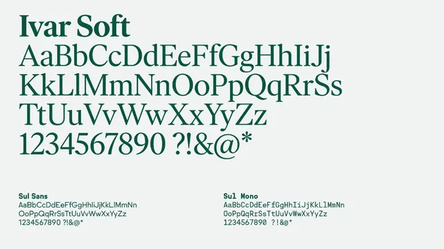
A minimal type specimen showing the complete character set of Ivar Soft, organized in a two-column grid with uppercase, lowercase, numerals, and punctuation.
Summary
A type specimen for Ivar Soft sans-serif showing the full character set across two columns with exemplary functional layout.
Visual description
Light gray background with two columns of dark teal text. The left column displays the typeface name "Ivar Soft" in large letters, followed by the complete alphabet in uppercase and lowercase on separate lines, numerals, and punctuation marks. The right column repeats a similar character set in smaller type with technical annotation labels below each section. All elements are organized in a clean, left-aligned layout with generous line spacing, emphasizing the typeface's clarity and legibility at multiple scales.
Key takeaway
The efficient two-column grid that shows character coverage without overwhelming the viewer. The use of teal as a secondary accent color to organize columns. The technique of showing both display and caption sizes to demonstrate versatility.
Reuse notes
Foundational reference for designing type specimens, especially for developer-facing or technical fonts. Effective for showcasing character completeness without unnecessary decoration. Works well when the font itself is the subject and visual distractions would undermine legibility.
More like this





Keep what you find
A free account saves references to boards and can send you a weekly email of picks based on what you save.
To see every result, go Pro.