Preview image. Unlock full-res
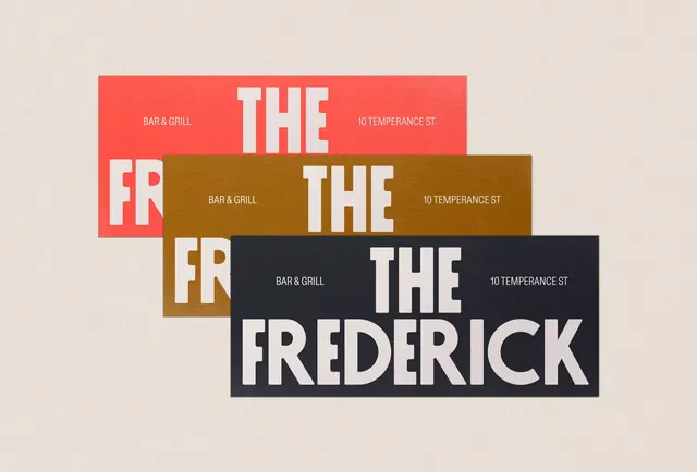
A typographic restaurant mark using three offset rectangular color blocks in red, olive brown, and charcoal, with bold white sans-serif wordmark stacked vertically.
Summary
A typographic restaurant mark using three offset rectangular color blocks in red, olive brown, and charcoal, with bold white sans-serif wordmark stacked vertically.
Visual description
Three rectangular color blocks stack and overlap diagonally across a warm beige background. The topmost red block holds "THE" and "FR" in broken white sans-serif with small gray copy "BAR & GRILL" and "10 TEMPERANCE ST". An olive brown rectangle sits beneath, repeating the restaurant and address text. The largest charcoal-black rectangle anchors the bottom, featuring "THE" and "FREDERICK" in substantial white display type. Small caps "BAR & GRILL" and address repeat in white on the dark block. The staggered arrangement creates depth and visual tension, with the large black anchor dominating the composition while the red and brown blocks preview the full wordmark, inviting the eye to read down through the layered rectangles.
Key takeaway
The offset-block technique adds dimensionality and visual interest without illustration or ornament. Repetition of small supporting text (address, business type) across color blocks maintains brand consistency while serving a practical wayfinding function. Bold display type has enough weight to hold its own against the color blocks without needing a clear background.
Reuse notes
Highly effective for restaurant, bar, and hospitality brands that need a mark feeling both rustic and sophisticated. The color palette (terra cotta, olive, charcoal) works well for upscale casual dining. The stacked wordmark translates cleanly to signage, packaging, and digital. Best at larger sizes where the layering depth reads clearly.
More like this



Keep what you find
A free account saves references to boards and can send you a weekly email of picks based on what you save.
To see every result, go Pro.