Preview image. Unlock full-res
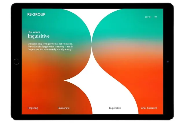
A symmetrical organic logo mark made of two facing curved shapes flowing from teal at the top through coral at the base, with a white negative space center point.
Summary
A symmetrical abstract logo of two facing organic shapes flowing from vibrant teal at the apex through warm coral at the base, creating a dynamic mark that reads as both a letterform and a fluid wave.
Visual description
Two mirror-image curved shapes form a mark where the upper halves are a rich teal green, transitioning smoothly through a middle band of warm olive and ochre, and meeting at a coral-orange base. A narrow white triangular negative space runs vertically through the center, pointing downward. The curves are organic and flowing, suggesting movement and transformation. The gradient shifts smoothly across the hue spectrum from cool to warm, creating depth and a sense of energy. The mark sits on a dark background (presentation context), allowing the vibrant gradient to read as the primary element.
Key takeaway
The technique of using a smooth multi-stop gradient across a complementary color range (teal to orange) to animate a simple organic shape. The symmetry creates a sense of balance and unity. The minimal white space in the center acts as a visual anchor and improves legibility at small sizes.
Reuse notes
Excellent for agencies, consulting firms, or design studios wanting to convey both creative energy and sophisticated structure. Works well in primary mark applications and scales across media (web, print, apparel). Best used at a size where the gradient is fully visible; monochrome applications would simplify the form to the outline.