Preview image. Unlock full-res
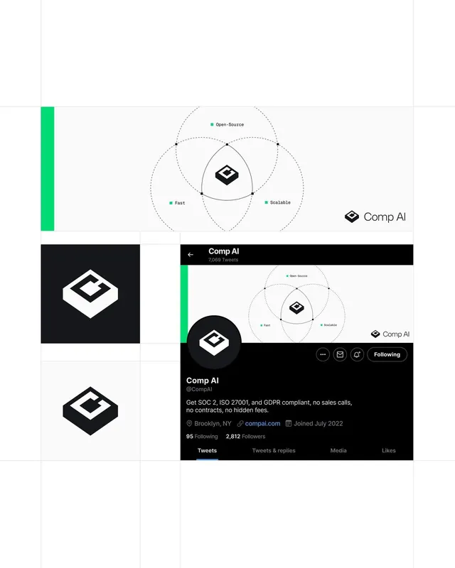
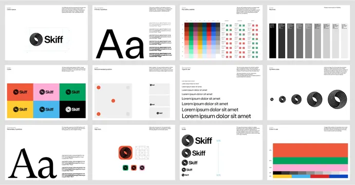
A comprehensive identity guide showing typography, color palette, logo variations, and icon system in a clean grid layout with white backgrounds and minimal visual hierarchy.
Summary
A multi-page brand identity guide for Skiff, laid out as a grid showing logo lockups, type hierarchy, color swatch system, icon set, and secondary marks.
Visual description
The image shows twelve identity guide pages arranged in a 4x3 grid, each on white or light paper. Top-left page shows a large circular "Skiff" logo with a black dot inside a ring. The next page displays oversized letterforms "Aa" with small caption text below. Subsequent pages show a horizontal gradient strip (rainbow spectrum), a color dot array (various tints and shades in a structured pattern), and several pages with icon variations, brand mark combinations, and supporting graphics. All pages use strict alignment to a grid, sans-serif captions in small type, and consistent white space. The overall palette is black, white, and accent colors (orange, teal/green) appearing on select pages.
Key takeaway
The systematic modular approach to identity documentation: one concept per page, consistent grid layout, and restrained typography scale (one or two weights, small caption size). The brand mark itself is simple (monogram inside a perfect circle), which scales well and reproduces at any size. The color palette is compact and high-contrast, making it easy to remember and apply. Icon set shown in related poses/sizes to imply consistency.
Reuse notes
Ideal reference for B2B SaaS or developer tools needing structured, no-nonsense brand presence. The minimal color accent (one or two spot colors) keeps production costs low and works on both digital and print. Strong for companies that want to feel systematic and trustworthy. Avoid this approach if the brand needs personality or playfulness.