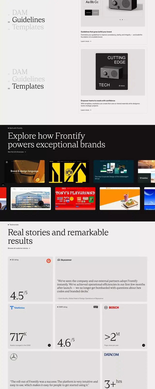
Preview image. Unlock full-res
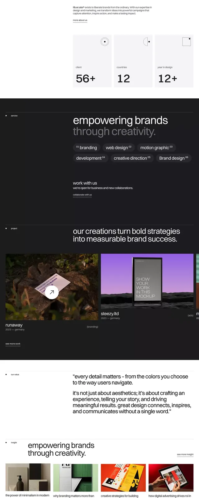
Minimal type specimen in dark mode, using pure black backgrounds, white sans-serif, and structured grid to showcase typographic hierarchy and rhythm.
Summary
Minimal type specimen in dark mode, using pure black backgrounds, white sans-serif, and structured grid to showcase typographic hierarchy and rhythm.
Visual description
A vertical scroll through a dark-mode type specimen. Black backgrounds with white sans-serif typeface dominate; warm neutral accents (muted orange-brown, light gray-tan) appear sparingly in headings and dividers. The layout is built on a clear grid with generous left/right margins and consistent vertical spacing. Section hierarchy emerges through size contrast and negative space: large display headings, medium body text, small footnotes, and utility labels all aligned left. Midway through, a single warm accent color bar punctuates the composition. The specimen demonstrates scale relationships across display and body sizes, all in one clean sans-serif family. Photography or imagery is absent; pure typography and spatial rhythm carry the narrative.
Key takeaway
The constraint of monochrome + one warm accent creating sophistication without clutter. The grid discipline with breathing room rather than packed density. Using size and weight alone to signal hierarchy without color or italic variation.
Reuse notes
Ideal for design agencies, studios, or tech companies documenting a typeface system or design language. Works for type-heavy presentations where the type itself is the subject. Pair with generous margins and avoid competing imagery.
More like this






Keep what you find
A free account saves references to boards and can send you a weekly email of picks based on what you save.
To see every result, go Pro.