Preview image. Unlock full-res
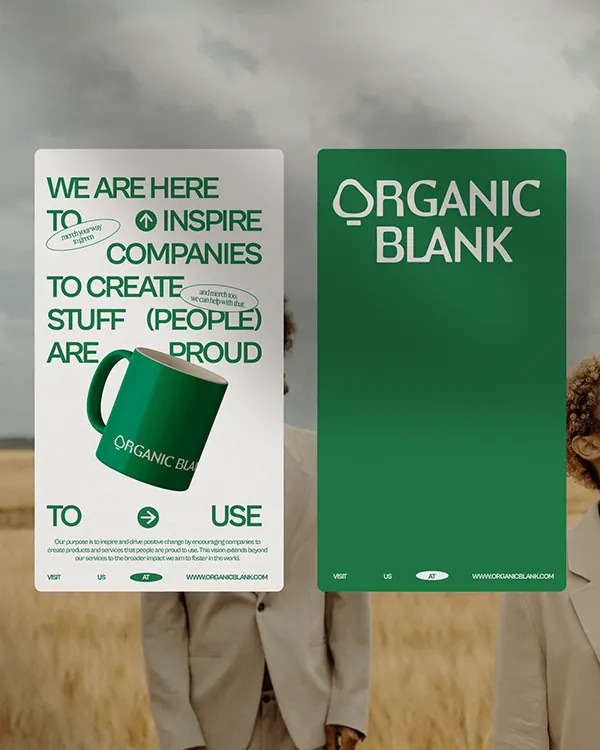
A two-poster identity system in forest green and cream with bold sans-serif typography, demonstrating minimalist brutalism applied to sustainable branding.
Summary
A two-poster identity system in forest green and cream with bold sans-serif typography, demonstrating minimalist brutalism applied to sustainable branding.
Visual description
Two vertical posters side by side. The left poster features white text on a forest-green background with a single line of sans-serif type reading "ORGANIC BLANK" in a bold geometric sans. The right poster shows a cream or off-white background with green typography, centered and spacious. Both use the same typeface family at different weights and scales, creating a cohesive but distinct visual pairing. The composition emphasizes whitespace, letting the typography and two-color palette do all the work. A wooden surface with rope or twine is visible behind the posters, grounding the system in a tactile, craft-oriented context.
Key takeaway
The two-color identity system applied across contrasting poster variants without losing cohesion. Bold, geometric sans-serif as the entire visual identity, relying on scale, weight, and inversion to create variation. Using environment (natural materials, textures) in the mockup to reinforce brand values without being literal.
Reuse notes
Ideal reference for eco-conscious, sustainable, or food brands seeking a clean, modern identity. The inversion strategy (type color flip, background swap) works especially well for systems that need both digital and print applications. Works best when the typeface chosen has strong weight variations. Avoid if brand needs color complexity or illustration.
More like this




Keep what you find
A free account saves references to boards and can send you a weekly email of picks based on what you save.
To see every result, go Pro.