Preview image. Unlock full-res
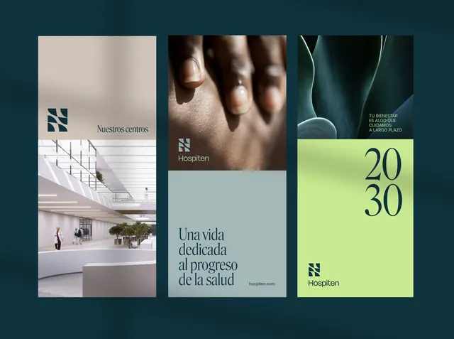
Healthcare identity system for Hospiten combining a modular teal logo with photographic and data-driven panels, unified by a deep teal background and muted color palette.
Summary
Healthcare brand identity for Hospiten pairing a modular geometric logo with three distinct brand applications: an institutional interior, human-centered photography, and data-driven messaging with a lime accent.
Visual description
Three branded panels sit against a deep teal background. Left panel shows institutional architecture (staircase and atrium) with beige photography and the text "Nuestros centros" (Our centers) alongside a modular geometric logo in teal. Center panel features macro photography of hands with the mark "Hospiten" in white. Right panel displays a lime-green card with large numerals "20 30" and the tagline "Tu bienestar es algo que puede a largo plazo" in teal sans-serif. Warm beige tones and soft grays accent the photography throughout.
Key takeaway
The modular geometric mark (composed of chevron/square shapes) that scales confidently across applications. The restraint of dropping one accent color (lime) into an otherwise cool-neutral palette for impact. The deliberate mix of institutional photography, human detail, and data presentation to convey both scale and care.
Reuse notes
Strong template for healthcare, wellness, or institutional brands needing to signal trust, scale, and personal touch simultaneously. Works best when you have strong photography to anchor each application. The teal background unification is key to cohesion.
More like this



Keep what you find
A free account saves references to boards and can send you a weekly email of picks based on what you save.
To see every result, go Pro.