Preview image. Unlock full-res
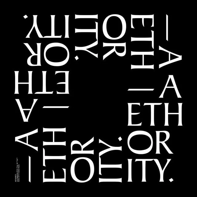
Bold all-caps sans-serif letters rotated and stacked in a high-contrast black-and-white grid, emphasizing typeface geometry and negative space.
Summary
Bold all-caps sans-serif letters arranged in a rotated grid composition on black background with white type, showcasing letter form geometry and negative space interplay.
Visual description
A full-frame black background filled with large all-caps sans-serif letterforms in white. Letters are rotated at various angles and densely stacked to create an abstract, kinetic grid. The typeface is clean, geometric, and highly legible despite the chaotic rotational arrangement. Words visible include fragments like "I FORTH", "ARETH", "ETHOR ITY" reading across the rotations. Fine print in small caps appears bottom-left corner. The pure black-white contrast and sharp letterforms create a stark, contemporary poster aesthetic with Swiss grid-design influence.
Key takeaway
The geometric sans-serif serves double duty as both readable text and abstract shape material. Rotating letters within a dense composition transforms a simple type arrangement into a visually dynamic, gallery-quality specimen. Use this treatment for: contemporary poster campaigns, gallery invitations, or editorial spreads where type itself is the subject.
Reuse notes
Strong for design studios, agencies, or cultural institutions needing bold, intellectual branding. Works as a poster, book cover, or exhibition identity. The high contrast reads well at scale; pairs well with minimal color palettes and generous whitespace elsewhere in the design system.
More like this






Keep what you find
A free account saves references to boards and can send you a weekly email of picks based on what you save.
To see every result, go Pro.