Preview image. Unlock full-res
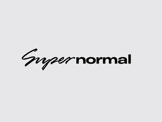
A minimalist wordmark pairing cursive script letterforms for 'Super' with crisp sans-serif for 'normal' on a neutral gray ground.
Summary
A two-word wordmark combining fluid handwritten script for "Super" with clean geometric sans-serif for "normal", centered on a light gray background.
Visual description
Light gray background with a centered, two-component wordmark. The first word "Super" is rendered in a bespoke, flowing cursive or script typeface with elegant, hand-drawn qualities and organic letterforms. The second word "normal" is set in a modern, geometric sans-serif with uniform weight and minimal flourish. The two typographic treatments create a clear visual hierarchy and contrast: informal elegance paired with formal precision. The wordmark is black on the neutral background, with plenty of surrounding whitespace, emphasizing the typography's confidence and simplicity. The overall impression is contemporary, premium, and approachable.
Key takeaway
The tension between handwritten expressiveness and clean sans-serif structure creates memorable contrast without appearing chaotic. By reserving the script for a single word, the designer avoids decoration overload while signaling personality and approachability. The neutral monochromatic treatment on a gray ground forces the letterforms themselves to carry the design weight, making it versatile for application across media.
Reuse notes
Ideal for contemporary brands seeking premium yet relatable identity (tech, lifestyle, design). Works across digital and print without losing character. The dual-typeface strategy pairs well with minimalist layout and generous whitespace. Less suited to formal/corporate contexts; the script element reads youthful rather than established. Reserve enough breathing room in layouts to avoid crowding the wordmark's open letterforms.
More like this


Keep what you find
A free account saves references to boards and can send you a weekly email of picks based on what you save.
To see every result, go Pro.