Preview image. Unlock full-res
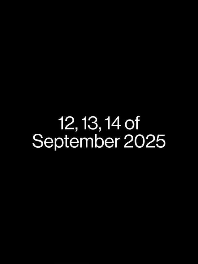
A single line of white sans-serif type announcing a date (12, 13, 14 of September 2025) centered on a pure black field, using extreme negative space for formal announcement or promotional impact.
Summary
A stark event-date announcement in white sans-serif centered on pure black, using overwhelming negative space and monochromatic contrast to create formal, authoritative promotional impact.
Visual description
Full-screen black background with white sans-serif type occupying only the vertical center, reading "12, 13, 14 of September 2025." The typeface is clean, geometric, and large-scale, with even kerning. Vast empty space above and below intensifies the weight of the single declarative statement. The composition is perfectly centered, relying entirely on the contrast ratio (white on black, maximum WCAG AAA) and the proportional restraint of the type sizing to create an impression of gravity and seriousness. No other elements, no visual noise, no color.
Key takeaway
The power of negative space as a design tool: the emptiness makes the type louder, not quieter. The use of pure black and white (not near-black, not off-white) for maximum symbolic authority. The centered composition and simple line breaks in the date for scannability without ornament.
Reuse notes
Highly effective for high-end event invitations, tech product launches, and premium brand announcements where restraint signals sophistication. Works at all scales (poster, screen, print) because contrast is absolute. The stark aesthetic risks reading as cold or austere, so pair it with warm copy or contextual design elsewhere if the brand aims for approachability. Common for architecture, design conferences, and upscale fashion events.
More like this




Keep what you find
A free account saves references to boards and can send you a weekly email of picks based on what you save.
To see every result, go Pro.