Preview image. Unlock full-res
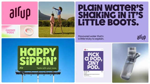
A bento grid of air up brand applications: wordmark, pod packaging, campaign headline, billboard, social post and product render.
More like this
See all
Summary
A single frame showing the whole identity at once, laid out as a bento grid of seven unequal panels on white, each holding a different brand application.
Visual description
Panels have generous rounded corners and sit on a white ground with even gutters. Top left, a pink tile carries the plum air up wordmark on its rising baseline. Beneath it, two small tiles: a pale gradient pack front reading "GUAVA PODS" in pink, and a soft-focus render of a white ring shaped flavor pod on a peach gradient. The tall center-left panel is a sunlit lifestyle photo of two people in pink and blue outfits on a lawn, one on a stepladder lowering a bottle on a hose. Top right, a lilac panel holds an oversized dark plum all-caps headline over three lines, "PLAIN WATER'S SHAKING IN IT'S LITTLE BOOTS.", with small sub-copy "Flavoured water that's a little tricky to explain." lower left and the wordmark lower right. Bottom left, a photo of a dark green billboard against a blue sky with lime green display copy "HAPPY SIPPIN'" and the line "Taste with your nose." Bottom center, a mocked-up social post on pale lilac: a purple square post reading "PICK A POD, ANY POD." with avatar, like and comment row and caption beneath. Bottom right, a close product render of a frosted bottle with a white loop cap, tumbling against a blue and white gradient.
Key takeaway
One frame carrying wordmark, pack, out-of-home, social and product proves system range faster than a sequence of slides. The panels are unified by a single rounded corner radius and a shared display face while every panel changes color, so the system reads as flexible rather than repetitive.
Reuse notes
Strong template for a case study hero or a brand summary slide where you have to show breadth in one image. Works best when the assets already share a type voice, since color is doing none of the unifying here. Requires at least one photographic panel to stop the grid feeling like flat swatches.
More like this

Keep what you find
A free account saves references to boards and can send you a weekly email of picks based on what you save.
To see every result, go Pro.