Preview image. Unlock full-res
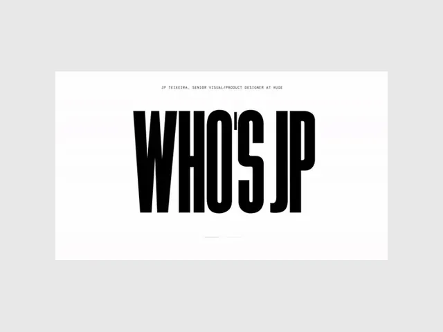
A stark display type specimen showing 'WHOISJP' in ultra-heavy condensed sans-serif, dominating white space against a light background.
Summary
A designer's personal type specimen featuring 'WHOISJP' in an ultra-heavy, narrowly condensed geometric sans-serif, set against white in a studio-white card against pale gray.
Visual description
A white rectangular card on a muted gray background contains the word 'WHOISJP' in black, ultra-condensed sans-serif capital letters. The typeface is monochromatic and geometric, with tight letter-spacing emphasizing the weight and width of each character. A small typographic credit line appears above the specimen text. The composition is rigorously centered, with the letterforms occupying roughly half the card's width, leaving substantial white space on all sides. The design conveys confidence and clarity through formal constraint.
Key takeaway
The clarity gained from pairing an extremely bold typeface with white space and zero decoration. The designer here avoids any color, gradient, or compositional flourish, letting the type's weight and geometry do all the work. The small credit line, tucked near the top, models how to add context without compromising the main focal point.
Reuse notes
A strong reference for portfolio work, design studio branding, and type-forward identity systems. The aesthetic reads as contemporary and design-literate. Works best when the typeface itself is genuinely striking; the spareness of the layout offers nowhere for a mediocre letterform to hide. Not ideal for brands requiring warmth, playfulness, or accessibility priority.
More like this







Keep what you find
A free account saves references to boards and can send you a weekly email of picks based on what you save.
To see every result, go Pro.