Preview image. Unlock full-res
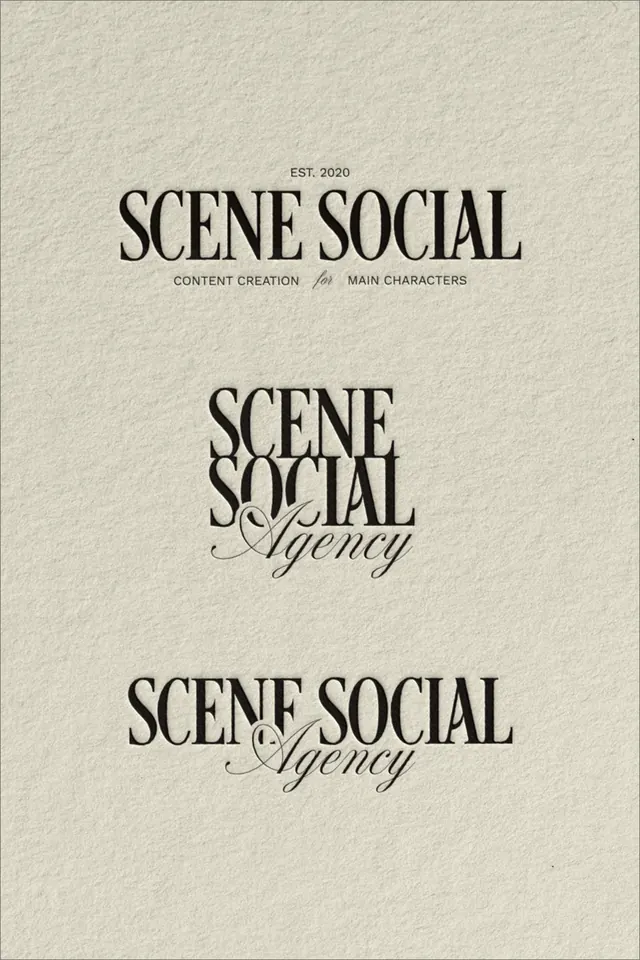
Serif type specimen for an agency brand, featuring three weight and style treatments of SCENE SOCIAL with supporting script flourishes and establishment year.
Summary
A serif type specimen showing SCENE SOCIAL wordmark in three treatments: a clean headline with supporting descriptors, a condensed variant with italic script flourish, and a secondary stacked layout, all on a cream linen texture.
Visual description
Centered on a cream-colored textured background (resembling linen paper). Top section displays "EST. 2020" in small capitals, then "SCENE SOCIAL" in a refined serif in regular weight, with small descriptive labels below: "CONTENT CREATION" and "MAIN CHARACTERS". Middle section shows "SCENE" on one line followed by "SOCIAL" below it, tighter than the headline, paired with italic script flourish reading "Agency" in a connected, elegant script, much lighter weight. Bottom section repeats the wordmark in a similar serif weight paired with a different script treatment of "Agency", italicized and flowing. Significant vertical spacing between sections emphasizes the type rather than crowding it. The palette is monochromatic: warm off-white background, dark charcoal or near-black text.
Key takeaway
The pairing of a classical serif wordmark with understated, handwritten-style italic script adds personality without clutter. Three distinct arrangements show how the wordmark can flex across applications while maintaining coherence. The generous negative space and centeredness convey sophistication and authority. The establishment date anchors the brand as established, not startup.
Reuse notes
Strong model for creative agencies, media companies, and production houses seeking a serious, authoritative tone. The serif + script pairing works particularly well when the brand targets sophisticated, editorial, or content-driven verticals. The monochrome approach is timeless and works across all media. Not ideal for tech-forward or minimalist brands where serif feels heavy.
More like this





Keep what you find
A free account saves references to boards and can send you a weekly email of picks based on what you save.
To see every result, go Pro.