Preview image. Unlock full-res
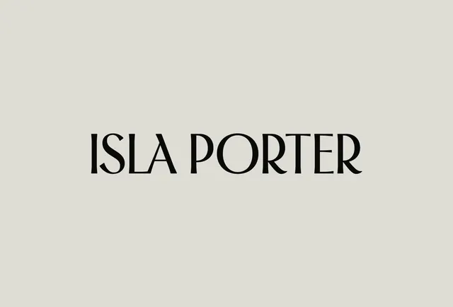
Beige-on-neutral type specimen: a serif-influenced display typeface spelling 'ISLA PORTER' centered on a light gray-beige ground, demonstrating sophisticated minimalist typographic branding.
Summary
A centered serif wordmark ("ISLA PORTER") set in a refined display typeface against pale beige, demonstrating restrained luxury branding through typography alone.
Visual description
Horizontal centered composition on a light beige-gray field. Large serif-influenced display typeface spells "ISLA PORTER" in black with generous letter spacing. The letterforms are tall and elegant with subtle serifs and refined proportions. Ample white space above and below the text reinforces the minimalist approach. The typographic color is deep charcoal-black, creating high contrast against the neutral ground.
Key takeaway
The use of typography as the entire branding statement, letting generous negative space do the compositional work. The serif scale and spacing demonstrate how oversized, well-spaced type needs minimal support. This approach is reusable wherever premium positioning depends on restraint rather than visual complexity.
Reuse notes
Strong reference for luxury goods, design studios, or editorial brands where typography is the hero. Works best when the typeface itself is distinctive. Pairs well with minimal color palettes and requires clean reproduction to maintain the elegance.
More like this






Keep what you find
A free account saves references to boards and can send you a weekly email of picks based on what you save.
To see every result, go Pro.