Preview image. Unlock full-res
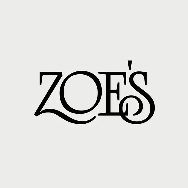
The wordmark 'ZOFS' rendered in a high-contrast serif display font with elegant flourished swashes on a light beige background.
Summary
A serif wordmark "ZOFS" rendered in a high-contrast display font with flowing flourishes on a light neutral background.
Visual description
Four letterforms spelling "ZOFS" in a bold serif typeface with pronounced thick downstrokes and elegant swashed terminals, particularly on the final "S". The letters have classical proportions with sharp serifs and geometric curves. A small accent mark appears above the second letter. The type is set in black on a light beige or off-white background with abundant negative space, emphasizing the letterforms. The overall treatment is refined and minimal, using only the typography and its spatial breathing room.
Key takeaway
The combination of weight contrast within the font (thick and thin strokes) creates dynamism within a restrained palette. The strategic use of flourishes on the "S" adds personality without becoming decorative or chaotic. The light background and centered positioning demonstrate how elegant type can carry a design on its own merit.
Reuse notes
Ideal as a custom type treatment for luxury brands, editorial mastheads, or fashion identities. The serif weight makes it legible at large sizes but loses refinement if scaled below display size. Pairs well with minimal layout, generous spacing, and complementary sans-serif body copy. Works particularly well in black and white or single-color applications.
More like this


Keep what you find
A free account saves references to boards and can send you a weekly email of picks based on what you save.
To see every result, go Pro.