Preview image. Unlock full-res
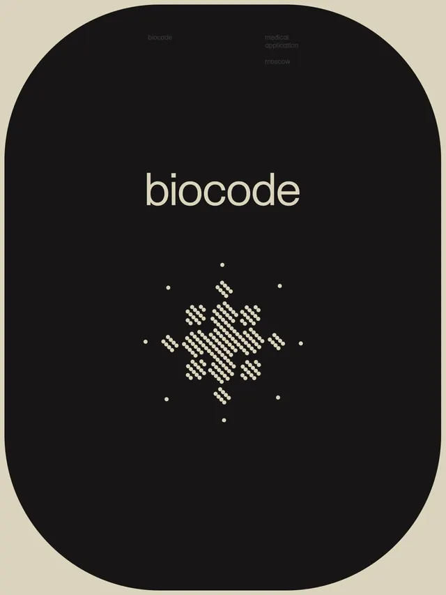
Minimal dark identity for biotech: geometric sans-serif wordmark paired with a centered dot-cluster icon in a rounded-rectangle frame.
Summary
A minimal biotech identity built around a beige-on-black wordmark inside a rounded-rectangle shape, with a geometric dot-cluster icon as secondary mark.
Visual description
The primary frame is a tall rounded rectangle in black, anchored on a beige background. The wordmark "biocode" sits centered in light, geometric sans-serif type (all lowercase), with generous surrounding space. Below it, a secondary icon composed of small cream-colored dots arranged in a connected grid pattern, suggesting molecular or DNA structure. The dot clusters form a vertical symmetrical composition with anchor points above and below. Subtle secondary text labels (biocode, medical application, moscow) appear in muted gray at the top, suggesting context or product tiers.
Key takeaway
The quiet typographic hierarchy achieved through scale and space rather than color. The dot-cluster icon as a secondary mark that conveys tech/biotech without being logo-literal. The beige-on-black contrast for a premium but accessible look. The use of negative space to reinforce the wordmark.
Reuse notes
Strong for biotech, healthcare, medical SaaS, or AI brands where "structured" and "trustworthy" matter. The dot pattern scales well from icon to pattern fill. Avoid pairing with heavily illustrated work. The dark field works digitally and in dark-mode interfaces but may need inversion for print.
More like this






Keep what you find
A free account saves references to boards and can send you a weekly email of picks based on what you save.
To see every result, go Pro.