Preview image. Unlock full-res
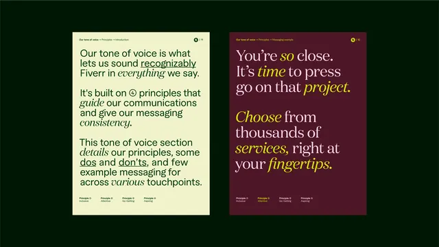
Brand voice guidelines presented as two contrasting cards: one on deep green showing light copy, one on wine-red showing warm gold and cream text, demonstrating how tone adapts across contexts.
Summary
Two side-by-side tone-of-voice guide cards demonstrating how brand voice shifts across contexts: a cool deep green card with cream guidance, paired with a warm burgundy card showing gold and light text, each introducing principles that guide communications.
Visual description
The composition presents two rectangular cards in a 1:1 ratio. The left card has a deep forest green background with light cream text. Its header introduces tone of voice with a small circular icon, followed by body copy explaining how principles guide communications and messaging consistency across touchpoints. The right card inverts the palette: a deep wine-red background with warm gold accents and cream copy, using the same header structure but a different principle statement. Both cards use the same sans-serif sans typeface for body copy, maintaining brand consistency, though the right card's headline features a serif accent (gold italic type on "time"). Small tag labels (written as product categories) sit at the base of each card in muted tones. The overall layout is symmetrical and card-based, suggesting these are modular brand system components. High contrast between text and background ensures legibility while the warm and cool color pairing demonstrates visual range within a controlled palette.
Key takeaway
The contrasting color pairs (cool green plus warm burgundy) show that a brand voice can feel different in different contexts without losing coherence; same structure, different temperature. The card format is modular and scalable, making it easy to add more voice principles without redesigning the system. The mix of serif accents in copy (the italicized "time" in the right card) adds typographic texture and draws the eye to key phrases.
Reuse notes
Useful for service brands, consulting, or agencies documenting how tone shifts by audience or channel (customer-facing vs. internal, formal vs. warm, direct vs. narrative). The complementary color scheme works when your brand spans both earthy/warm and cool/professional territories. Pair this pattern with a master tone-of-voice guide document; these cards alone are reference material, not instructional. The card structure also scales to icon usage, value statements, or usage rules.
More like this







Keep what you find
A free account saves references to boards and can send you a weekly email of picks based on what you save.
To see every result, go Pro.