Preview image. Unlock full-res
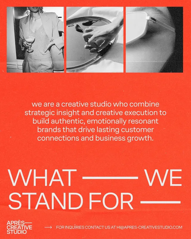
A split-panel brand poster combining monochrome lifestyle photography with vibrant orange-and-black graphic elements and bold statement typography.
Summary
A two-part poster promoting a creative studio, pairing monochrome lifestyle photographs with a vibrant orange bar housing black graphic shapes and white sans-serif statement copy about the studio's mission.
Visual description
Top third: three landscape-orientation monochrome photos showing hands, objects, and product detail arranged in a horizontal grid. Middle: a full-width vibrant orange band containing black abstract shapes (lines, curves, geometric marks) in a loose compositional grid. Bottom: white all-caps sans-serif headline reading "What We Stand For" with small underlines as separators, followed by a paragraph of white type on the orange background describing the studio's approach. The studio name and website sit in the lower corner. Tight margins and precise alignment emphasize the grid structure.
Key takeaway
Orange-as-primary creates energy and warmth while remaining corporate-appropriate. The abstract black shapes animating the orange bar distract from what could be bland color blocking. Pairing cool monochrome photography with a warm accent creates visual tension that draws attention. All-caps, letter-spaced sans-serif on colored ground is highly legible and builds confidence.
Reuse notes
Ideal for creative agencies, consulting firms, and purpose-driven brands that need to convey both human connection (photography) and strategic thinking (abstract graphics and statement copy). Warm accent colors (orange, terra cotta, burnt sienna) work better than cool ones here. Consider if your photography subjects and studio philosophy have enough personality to fill the frame without additional styling.
More like this




Keep what you find
A free account saves references to boards and can send you a weekly email of picks based on what you save.
To see every result, go Pro.