Preview image. Unlock full-res
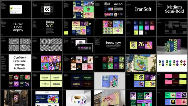
Grid overview of a full brand guidelines document, showing logo rules, type, color, pattern systems, illustration and applied layouts as dozens of dark slides.
More like this
See all
Summary
A single contact sheet showing an entire brand guidelines deck at once, roughly six columns of small dark slides that step from mark construction through to applied out-of-home work.
Visual description
Dozens of near-black landscape slides are tiled edge to edge with thin gutters. Reading across the rows: a social profile mock, a clearspace and safe-zone diagram for the double-chevron symbol, a design-system overview board, a logotype and typography summary, then two large type specimen slides reading "Ivar Soft" in a serif and "Medium Semi-Bold" in the same family. The next band covers a secondary display face ("Duplet Open display"), type hierarchy with the "Rejoice in your choice" headline, brand color usage, editorial layouts, a swatch grid of named colors with values, and wireframe grid layouts. A row of black-and-white pattern slides follows: concentric circles, diagonal stripes, a pattern creation guide and painting-grid screenshots, plus a "Screw new." type usage slide and packaging renders. Lower rows carry brand attribute words ("Confident Optimistic Human Authentic" on a white slide), a bright illustration library, a product photography grid, layouts with integrated imagery, a building-scale mural, a logo color-pairing chart, campaign layouts on dark and teal backgrounds, an accessibility contrast-ratio board, and applied shots: transit poster, website homepage, sticker roll, urban billboard.
Key takeaway
The whole system is legible in one frame because every slide keeps the same black field, the same tiny top-left caption block and the same margin, so the imagery alone carries the variation. It is a useful model for presenting a guidelines document as a portfolio artifact rather than page by page.
Reuse notes
Reach for this layout when you need to show breadth of a brand system in a single image: case study hero, deck summary slide, or a portfolio thumbnail. Individual slides are unreadable at this scale, so treat it as texture and pair it with detail crops. Requires a large slide count to look intentional.
More like this



Keep what you find
A free account saves references to boards and can send you a weekly email of picks based on what you save.
To see every result, go Pro.