Preview image. Unlock full-res
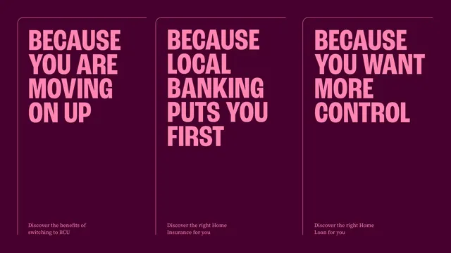
Three flat portrait poster layouts on deep plum, each carrying only an oversized pink condensed all-caps headline and a small serif line at the foot.
More like this
See all

Summary
Three stripped-back poster layouts side by side on one plum field, showing the campaign voice with nothing but type: a huge pink headline at the top, a small serif line at the bottom, and a lot of empty space between.
Visual description
The full frame is a single deep plum background. Three tall panels sit across it, each defined only by a hairline pink rule that runs down the left edge and curves into a rounded corner at the top, leaving the right side open. Panel one reads "BECAUSE YOU ARE MOVING ON UP", panel two "BECAUSE LOCAL BANKING PUTS YOU FIRST", panel three "BECAUSE YOU WANT MORE CONTROL", all in a heavy condensed all-caps sans, mid-pink, ranged left and broken across four or five short lines. Type sizes differ slightly per panel so each headline fills its column width. The lower two thirds of each panel is empty. At the foot of each column, two lines of small pink serif read "Discover the benefits of switching to BCU", "Discover the right Home Insurance for you" and "Discover the right Home Loan for you".
Key takeaway
The open-sided keyline: a rule that starts at the top, turns one rounded corner and runs down the left only, implies a frame without closing one and lets the three panels share a single background. Leaving two thirds of each poster empty makes the headline read as a statement rather than an ad.
Reuse notes
Good for a campaign line study, a section divider, or any moment where the message alone should carry. The three-up presentation is useful for showing copy variants in a deck. Only works with a headline face that holds up at very large sizes and with copy short enough to keep the lower space genuinely empty.