Preview image. Unlock full-res
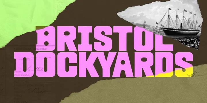
Chunky pink slab wordmark set over a torn-paper collage of archival ship engraving, handwritten ledger scans and lime and yellow paper edges.
More like this
See all
Summary
A wide brand key visual that stacks the words BRISTOL and DOCKYARDS in heavy pink display caps across a torn-paper collage of archival maritime material.
Visual description
The field is a dark olive brown with a visible paper grain. Torn edges break into it from three corners: a lime green sheet top left, a soft yellow wedge bottom right, and a lighter khaki band along the bottom. Top right, a ragged tear opens onto a black and white engraving of a multi-masted sailing steamship dressed with flags, with a crowd on the quayside below. Faint scanned ledger and menu text sits in the lower left ("VEGETABLES, ASSORTED.", "Pastry.", "Plum Pudding.") along with loose ink handwriting. Over all of it, two lines of very heavy pink caps in a squared slab display face fill the width: BRISTOL on the upper line, DOCKYARDS below, tightly set with almost no letter spacing and slight overlap between the lines. The type is flat pink with no outline, letting the collage texture read through the darker background around it.
Key takeaway
Fat contemporary display type sitting directly on top of archival scans is what makes the heritage read as current rather than antique. The torn paper edges act as the only compositional device, framing the ship engraving and the wordmark without a single rule or box.
Reuse notes
A good model for museums, heritage sites and city attractions that need to feel young without losing their archive. Depends on genuinely good archival source material and a display face heavy enough to survive the busy ground. The pink and olive pairing is doing most of the work, so a weaker color contrast would let the type sink into the texture.
More like this
Keep what you find
A free account saves references to boards and can send you a weekly email of picks based on what you save.
To see every result, go Pro.