Preview image. Unlock full-res
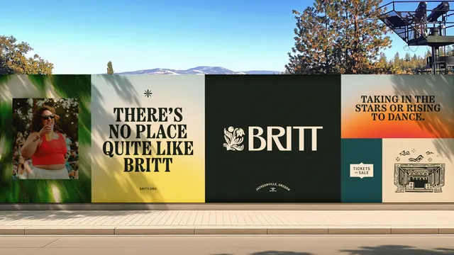
Long outdoor hoarding split into six brand panels: a crowd photo, a serif headline, the leaf-and-wordmark lockup on dark green, a sunset gradient and a linocut stage illustration.
More like this
See all
Summary
A run of hoarding along a pavement, divided into panels that each carry one piece of the identity: image, headline, logo, message and illustration.
Visual description
The hoarding runs the full width of the frame at roughly eye height, with pine trees, a mountain ridge and a stage tower behind it and tree shadows falling across its face. From the left: a deep green panel holding a square color photograph of a smiling festivalgoer in a red top holding a drink in a crowd; a cream to yellow gradient panel with a small asterisk mark above the headline "THERE'S NO PLACE QUITE LIKE BRITT" in four lines of bold high contrast serif caps, with a small letter-spaced "BRITT.ORG" beneath; a dark green panel carrying the primary lockup, an ornamental leaf and sun symbol locked to the word BRITT in large cream serif caps, with the arced line "JACKSONVILLE, OREGON" and a small flourish below. The right end splits into three smaller blocks: a yellow to orange gradient panel with "TAKING IN THE STARS OR RISING TO DANCE." in dark serif caps, a teal block holding a shaped "TICKETS ON SALE" badge, and a cream block with a black linocut style drawing of the amphitheatre stage under wavy sky lines and small sparks.
Key takeaway
One modular panel width lets the identity alternate between photography, type, logo, gradient and illustration without a template, and the mix is what makes a long blank hoarding feel like a place. Reserving the darkest panel for the lockup alone gives the mark a rest stop in a busy run.
Reuse notes
A useful pattern for festival hoardings, event fencing and any long horizontal surface: treat it as a filmstrip of brand assets rather than one stretched artwork. Requires at least four distinct asset types to avoid repetition, and a consistent type scale so the panels read as one system.
More like this



Keep what you find
A free account saves references to boards and can send you a weekly email of picks based on what you save.
To see every result, go Pro.