Preview image. Unlock full-res
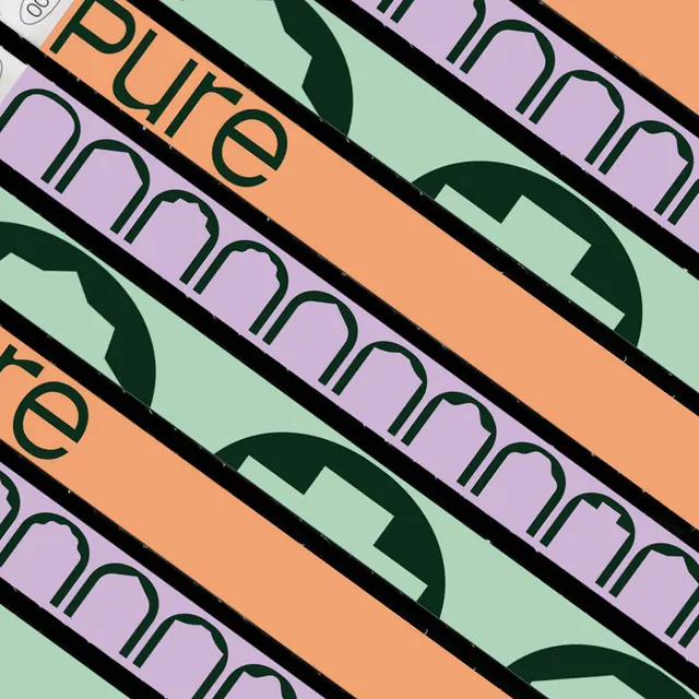
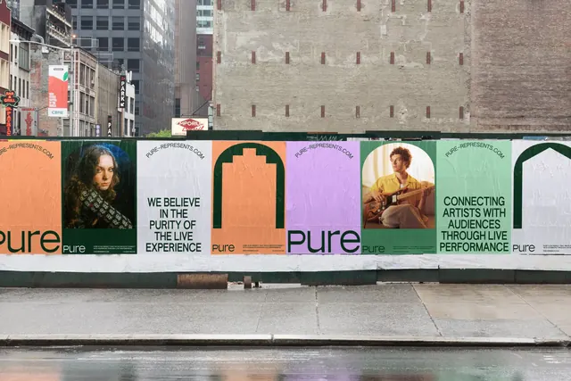
A street hoarding pasted with an alternating run of orange, white, lilac and mint posters carrying arch shapes, artist portraits and a lowercase green wordmark.
More like this
See all

Summary
A wide shot of a construction hoarding papered with a repeating sequence of Pure posters, the run reading as one long horizontal band of alternating flat colors punctuated by arch-cropped artist portraits.
Visual description
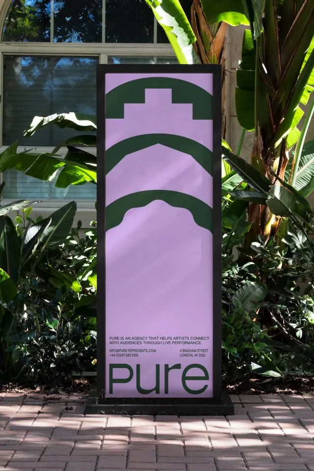
The hoarding runs the full width of the frame at street level, with New York brick, fire escapes and a blank concrete party wall behind it and a wet sidewalk in front. The poster sequence cycles through four types. Color-field sheets in orange, lilac and mint carry a large lowercase "pure" wordmark in deep forest green, set flush left at the base and cropped by the sheet edge. Statement sheets on white carry all-caps green copy set ragged over four lines: "WE BELIEVE IN THE PURITY OF THE LIVE EXPERIENCE" and "CONNECTING ARTISTS WITH AUDIENCES THROUGH LIVE PERFORMANCE". Portrait sheets place a musician inside a tall arch-shaped crop against a green panel, one a woman in a patterned top, one a man seated with an electric guitar. Shape sheets show only a thick green outline of a castellated arch on flat orange or a plain arch on white. Small caps "PURE-REPRESENTS.COM" runs along the top edge of the white sheets, and a tiny green block of body copy and contact details sits beside the wordmark on the color fields. The wordmark itself is a geometric lowercase sans with a wide bowl on the p and a horizontally cut e, always set in the same deep green regardless of the background color.
Key takeaway
Designing the poster as a module in a run rather than a single sheet. Because the four poster types alternate, the pasted wall composes itself into a rhythm, and the arch keeps returning as an outline, a photo crop and a silhouette so it reads as a mark without ever being a logo.
Reuse notes
A good reference for music, festival and venue identities that live on fly-posting, and for any brand that will be pasted in multiples rather than seen alone. The pastel and orange palette needs the near-black green to hold contrast; dropping the green would collapse it. Note the pairing of long all-caps statements with wordless color fields as the pacing device.