Preview image. Unlock full-res
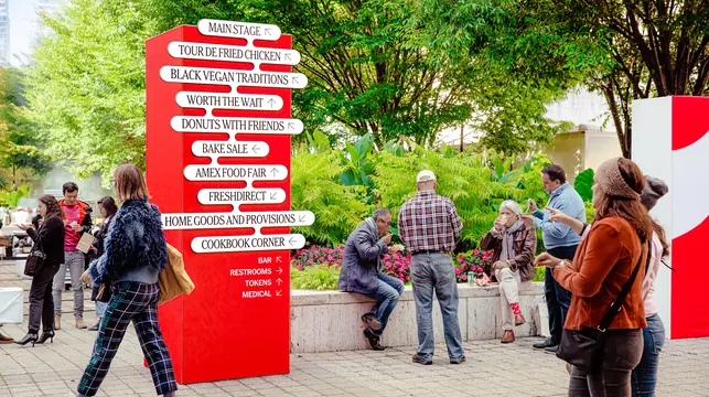
Tall red wayfinding totem stacked with white pill signs naming festival zones, photographed among visitors eating in a park.
More like this
See all

Summary
A red column carrying ten white pill signs of varying width, each naming a festival zone with a small directional arrow, working as the event's main directory.
Visual description
The totem is a tall red rectangular volume standing on paving in a park, with trees, flowering beds and a second red and white unit behind it. Ten white rounded pills project off its face, each with visible board depth and a dark edge, and each sized to its own line so the stack reads as a ragged column rather than a justified list. Entries run "MAIN STAGE", "TOUR DE FRIED CHICKEN", "BLACK VEGAN TRADITIONS", "WORTH THE WAIT", "DONUTS WITH FRIENDS", "BAKE SALE", "AMEX FOOD FAIR", "FRESHDIRECT", "HOME GOODS AND PROVISIONS" and "COOKBOOK CORNER", all in a high contrast all caps serif, each followed by a small thin arrow pointing up, left or down. Below the pills, four utility lines, bar, restrooms, tokens and medical, are set small and reversed in white directly on the red with their own arrows. Visitors in autumn coats stand and sit around the totem eating and drinking.
Key takeaway
Sizing every pill to its own line length makes a ten item directory scan quickly and turns a functional sign into the campaign's most graphic object. Demoting the utility items to plain reversed type keeps the hierarchy obvious without a second typeface.
Reuse notes
A good template for festival, conference and market directories where zone names are long and irregular. The serif holds up at this scale but the small arrows are the weak point at distance. Note the red volume needs to be tall enough to stay visible over a standing crowd.