Preview image. Unlock full-res
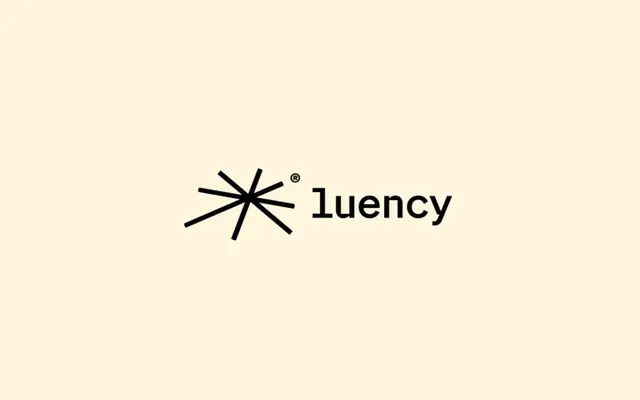
A geometric 8-pointed asterisk mark paired with clean sans-serif wordmark on cream background, establishing a minimal corporate identity.
Summary
Minimal two-part identity system using a geometric 8-pointed star mark alongside clean sans-serif wordmark against a cream background for a restrained, corporate aesthetic.
Visual description
A black geometric mark (two overlapping four-pointed crosses rotated 45 degrees from each other, forming an 8-pointed asterisk) sits to the left of the word "luency" set in a light, modern sans-serif on a warm cream background. The monochromatic color palette (black mark and text on cream) creates high contrast and legibility. The wordmark uses consistent letter spacing and a single weight, reinforcing geometric simplicity. The mark and text are center-aligned with generous breathing room within the frame.
Key takeaway
The disciplined use of a single geometric mark that echoes the letterforms above it, creating visual cohesion. The cream background softens the contrast without reducing legibility. The proportional balance between the icon and wordmark sets a clean ratio for lockup applications.
Reuse notes
Suitable for professional services, tech, and finance brands seeking minimal, trustworthy visual systems. The cream background works well for print and digital, though the mark may need refinement at small scales. Pairs well with generous whitespace and restrained color palettes.
More like this






Keep what you find
A free account saves references to boards and can send you a weekly email of picks based on what you save.
To see every result, go Pro.