Preview image. Unlock full-res
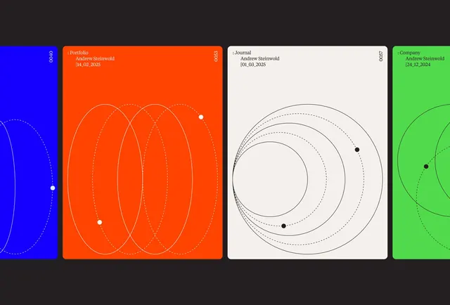
Four-panel identity system for a designer portfolio featuring geometric linework (concentric circles and ellipses) across indigo, orange, cream, and lime backgrounds with structured sans-serif labels.
Summary
Four-panel identity system for a designer portfolio using a triadic color scheme (indigo, orange, lime green) with layered geometric motifs and minimal typography, each panel representing a different category (Portfolio, Journal, Company, and partial fourth panel).
Visual description
Dark charcoal background framing four vertical card panels in a row. Left panel: electric indigo with concentric ellipses (solid and dashed white lines) and small accent dots; label "Portfolio / Andrew Steinwold / 14.02.2025" in white sans-serif. Center-left: vibrant orange card with the same ellipse geometry repeated; label "Portfolio / Andrew Steinwold / 14.02.2025". Center-right: off-white/cream card with black concentric circles (solid and dashed) and accent points; label "Journal / Andrew Steinwold / 01.03.2025". Right panel: bright lime green with partial curve geometry visible; label "Company / Andrew Steinwold / 24.12.2024". Each panel uses identical grid spacing and type size, establishing visual consistency across the color shifts.
Key takeaway
The triadic color blocking as a quick visual differentiator for category or portfolio section. The reusable concentric geometry (circles and ellipses) that remains recognizable across all color contexts. The use of accent dots to anchor the composition and create implied data points without literal content.
Reuse notes
Strong template for portfolio systems, design process documentation, or category-driven dashboards where color and geometry need to signal meaning. The geometric motifs work best when consistent across all panels. The all-caps, minimal type keeps focus on the shapes. Works at small scale and maintains clarity at large format.