Preview image. Unlock full-res
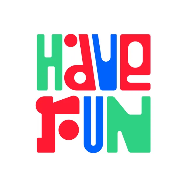
A stacked wordmark with bold, rounded sans-serif capitals in red, blue, and green, each letter rendered as a thick geometric shape.
Summary
A two-line stacked wordmark spelling "Have Fun" with thick, rounded uppercase letters in bright red, royal blue, and teal against a white background.
Visual description
The letters are individually colored: H and most vowels in teal, d and u in red, a in red, y in blue, F and n in their respective hues. Each letter is constructed from chunky geometric strokes with generous rounded terminals and counter-spaces. The proportions are generous and child-friendly, with consistent stroke weight throughout. A red circle sits atop the first line as an accent mark or decorative element.
Key takeaway
The bold color blocking by letter creates rhythm and movement without gradients or effects. The rounded, cutout-style letterforms work at any scale. The playful primary-color palette reads as approachable and unpretentious.
Reuse notes
Strong reference for youth-facing brands, children's products, and entertainment identity systems. Works best at large scale and when bright, unambiguous color is on-brand. Less suitable for premium or corporate applications where restraint is valued.