Preview image. Unlock full-res
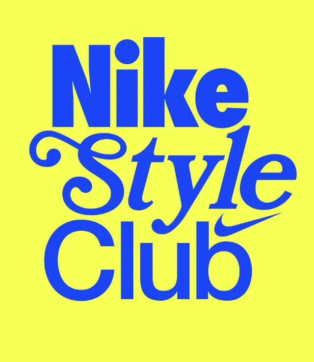
A three-line stacked wordmark mixing a bold rounded sans for Nike and Club with a swashy italic script for Style, set in royal blue on a fluorescent yellow field.
Summary
A three-line stacked logo lockup that contrasts a heavy rounded sans on lines one and three against an ornate italic script in the middle, all in royal blue on fluorescent yellow.
Visual description
The mark reads "Nike" / "Style" / "Club" stacked tight and centered. "Nike" and "Club" are set in a chunky, rounded geometric sans with high stroke contrast and tight spacing, filling the width of the frame. "Style" sits between them in a flourishing italic script with looping ascenders and a long terminal swash that sweeps under the word. A small Nike swoosh is tucked into the gap between "Style" and "Club" on the right. Everything is a single flat royal blue printed on a saturated yellow-green ground, no shading or outlines. The two-color, high-chroma pairing carries all the energy.
Key takeaway
The deliberate type clash: two weights of a serious display sans bracketing one ornate script line creates rhythm and a vintage athletics feel from type alone. Reusing one accent color on a loud complementary background means the lockup needs zero illustration to feel finished.
Reuse notes
A good template for a sporty or merch sub-brand lockup where you want playful nostalgia over corporate polish. The complementary blue-on-yellow is loud; tone the ground to a neutral if it needs to sit beside photography. Swap the swoosh for your own glyph to detach it from the parody.