Preview image. Unlock full-res
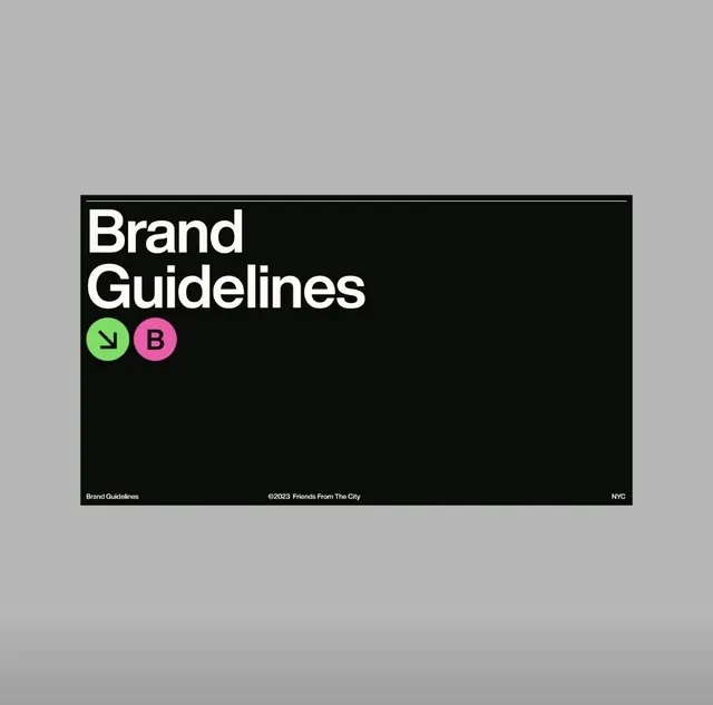
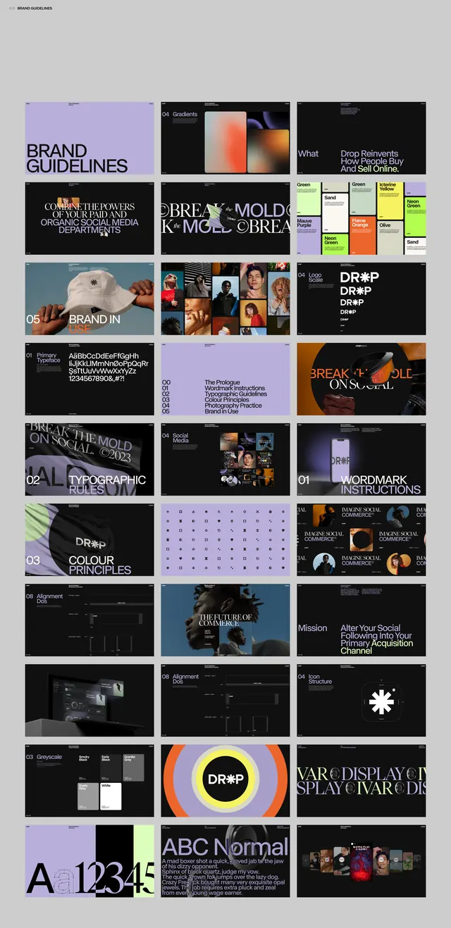
A minimalist brand guidelines layout using stark black background, oversized white sans-serif headline, and two colored circular badges as the only visual accent.
Summary
A brand guidelines document page with oversized white typography on black, accented by two small circular badges in lime green and hot pink.
Visual description
The layout is a horizontal rectangle with a jet-black background occupying most of the composition. Large white sans-serif text reading "Brand Guidelines" is positioned in the upper left, followed by two small circular badges directly below: one lime green with a white arrow icon, one hot pink with a white "B". At the bottom, minimal footer text in white reads "Brand Guidelines" on the left, "©2023 Friends From The City" centered, and "NYC" on the right, all in a small sans-serif.
Key takeaway
The discipline of using typography at display scale as the primary design element, reserving color for tiny, strategic accents (the badges). The badge shape and placement create visual rhythm without competing with the headline. The sparse footer information grounds the composition without visual weight.
Reuse notes
Strong reference for corporate identity systems that need to feel confident and restrained. The black-and-white foundation with two bright accent colors reads as modern and playful simultaneously. Works well for design studios, creative agencies, or any brand wanting to project boldness through restraint.
More like this





Keep what you find
A free account saves references to boards and can send you a weekly email of picks based on what you save.
To see every result, go Pro.