Preview image. Unlock full-res
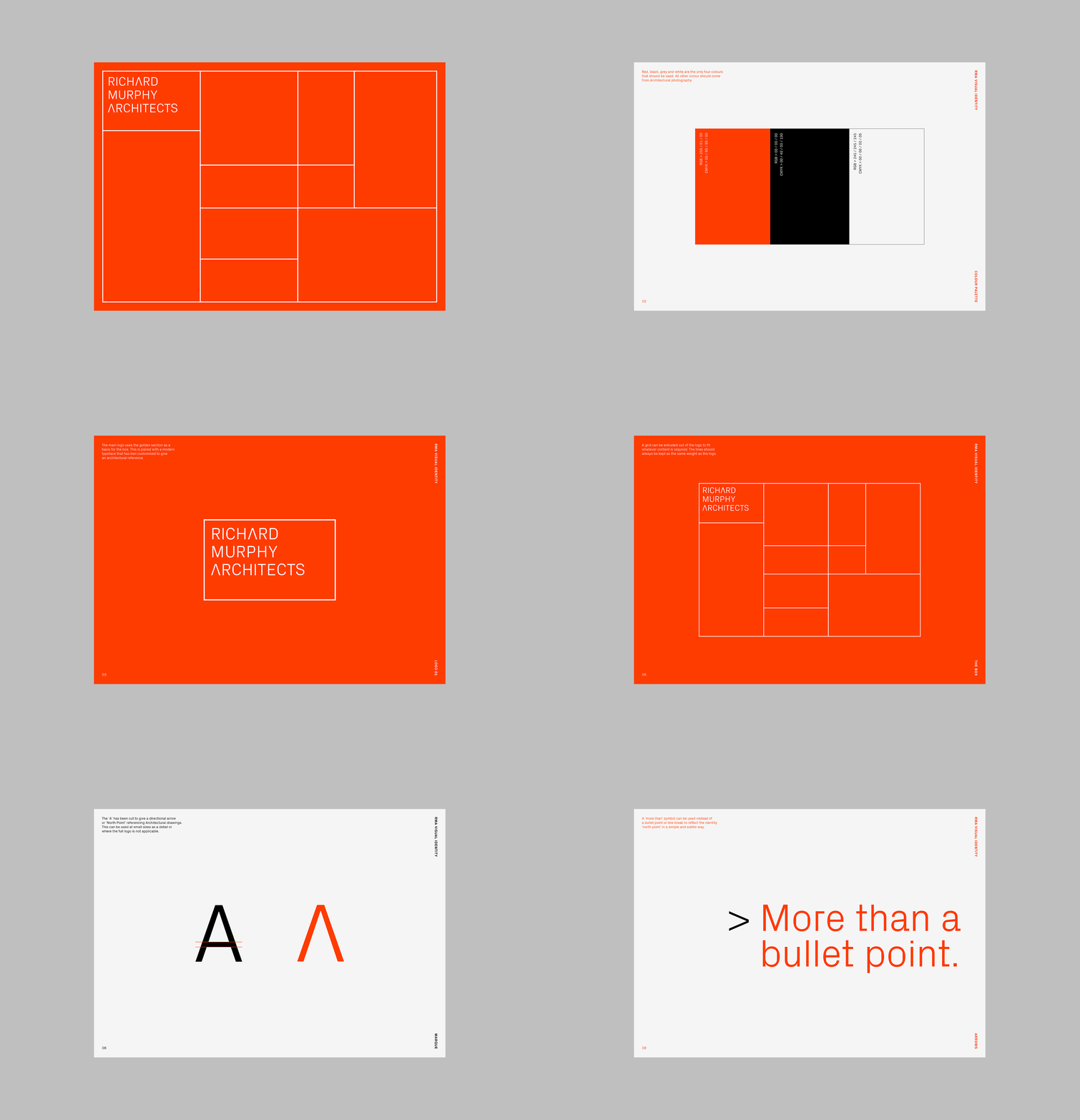
Architectural firm identity built on a clean, modular grid with bright red-orange fields and white structural lines dividing the composition.
Summary
Architectural firm identity built on a clean, modular grid with bright red-orange fields and white structural lines dividing the composition.
Visual description
A vibrant red-orange square divided by white horizontal and vertical lines into an asymmetric grid of nested rectangles. The firm name "RICHARD MURPHY ARCHITECTS" sits in white caps within the top-left compartment, aligned to the grid. The remaining subdivisions form a balanced, rhythmic pattern that reads as both a logo system and a spatial diagram, evoking floor plans or architectural drawing conventions.
Key takeaway
The modular grid as both visual identity and conceptual system. The color choice (warm, high-contrast red-orange against white) gives the identity confidence and memorability while remaining legible in small scale. The top-left text placement anchors the system while allowing the grid structure to dominate.
Reuse notes
Effective for architecture, design studios, or any portfolio practice where the identity itself can be an expression of process. The grid's modularity makes it extensible across stationery, signage, and digital applications. Works best when the field color remains constant and structural lines remain white for legibility.
More like this



Keep what you find
A free account saves references to boards and can send you a weekly email of picks based on what you save.
To see every result, go Pro.