Preview image. Unlock full-res
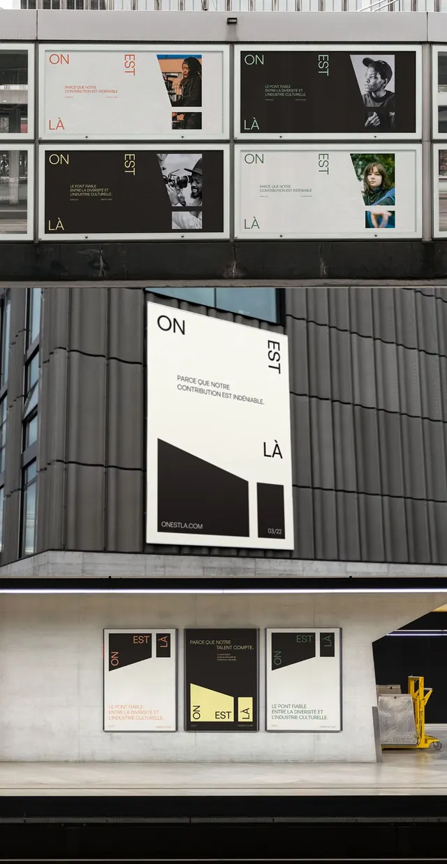
Modular black-and-white exhibition identity system with geometric dividers, typographic hierarchy, and photo-integrated layouts shown across multiple formats.
Summary
Modular black-and-white exhibition identity system with geometric dividers, typographic hierarchy, and photo-integrated layouts shown across multiple formats.
Visual description
A comprehensive identity system displayed across a dark textured wall shows the same modular grid applied to different contexts: exhibition panels, street-level signage, and wall-mounted materials. Each format combines white sans-serif type (ON / EST / LA) with angled black geometric shapes that act as photo frames or dividers. Portrait images sit within these angular black panels, creating strong compositional contrast. The grid structure repeats consistently, with small-scale body text stacked below headlines. A ruler or measurement reference runs along the top, indicating construction logic. All elements maintain strict alignment along a diagonal and horizontal grid system.
Key takeaway
The angled geometric divider as a photo frame and content organizer; the systematic reuse of the same grid across multiple scales and formats; the stark monochrome palette that makes typography and imagery the hero.
Reuse notes
Ideal for museums, galleries, or cultural institutions where a cohesive visual system must scale from signage to collateral. The diagonal geometry creates visual interest without color; the modularity makes it adaptable to different content lengths. Legible at both close and distance reading.
More like this





Keep what you find
A free account saves references to boards and can send you a weekly email of picks based on what you save.
To see every result, go Pro.