Preview image. Unlock full-res
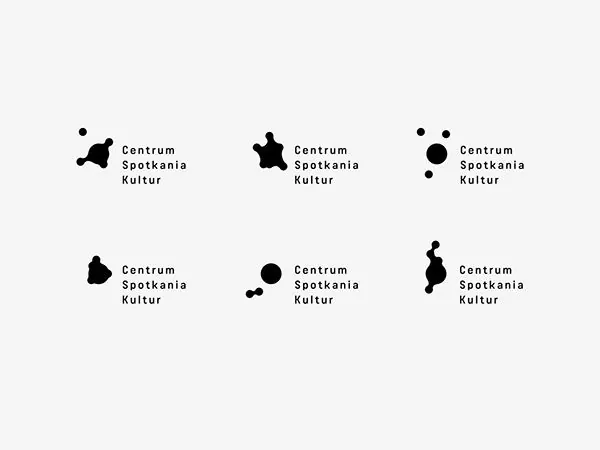
Minimalist logo system for a cultural institution featuring six variants of abstract black shapes paired with clean sans-serif typography on a light gray field.
Summary
Modular logo system for Centrum Spotkania Kultur (a cultural center) showing six abstract black geometric variations alongside small-cap sans-serif wordmark on a light gray background.
Visual description
Six logo treatments arranged in a two-by-three grid on a light-gray field. Each variant pairs an abstract black shape (organic, angular, or circular forms) with the text "Centrum Spotkania Kultur" set in a clean, contemporary sans-serif in small capitals. The shapes are solid black silhouettes with no fill variations or gradients. The text sits immediately to the right of each mark in consistent spacing. The overall system demonstrates flexibility through form variation while maintaining visual cohesion through consistent typography, color, and spacing discipline.
Key takeaway
A modular approach that shows a mark in multiple configurations without losing identity. Clean sans-serif paired with abstract geometric marks. Grid-based presentation of logo variations that demonstrates systematic thinking. The use of negative space and minimalist color to suggest sophistication and institutional trust.
Reuse notes
Ideal for nonprofits, arts organizations, museums, or educational institutions. The monochromatic palette is budget-friendly for print and reproduction. Scandinavian aesthetic appeals to audiences that value minimalism and cultural sophistication. Avoid if the brand needs warmth or playfulness.