Preview image. Unlock full-res
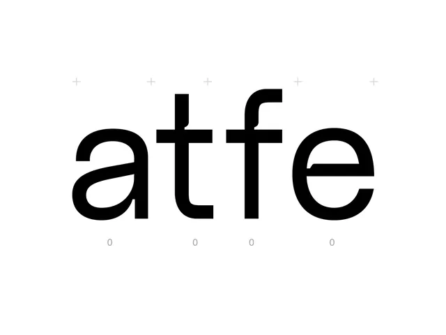
A black and white typeface specimen showing a sans-serif font family with geometric letterforms, paired with mathematical symbols and numerals spaced across a white field.
Summary
A bold geometric sans-serif typeface specimen showing the word "atte" with supporting numerals and mathematical operators, demonstrating consistent stroke weight and modular letterforms.
Visual description
White background with bold black letterforms spelling "atte" centered horizontally. Small plus symbols (+) are distributed evenly above the text as a decorative motif. Below the letters, small gray numerals (0, 0, 0, 0) align with each character. The letterforms have uniform stroke width, rounded terminals, and geometric counter shapes. The overall composition is balanced and symmetrical, with generous negative space.
Key takeaway
The consistent stroke-weight approach to geometric letterforms, and the use of small mathematical operators as a repeating visual rhythm above typography. The pairing of numerals below letters as a spacing reference for type systems.
Reuse notes
Ideal for branding systems, technical documentation, or corporate type families where modular letterforms and precision are valued. Works well as a reference for geometric sans-serif design where stroke consistency matters more than contrast variation.
More like this






Keep what you find
A free account saves references to boards and can send you a weekly email of picks based on what you save.
To see every result, go Pro.