Preview image. Unlock full-res
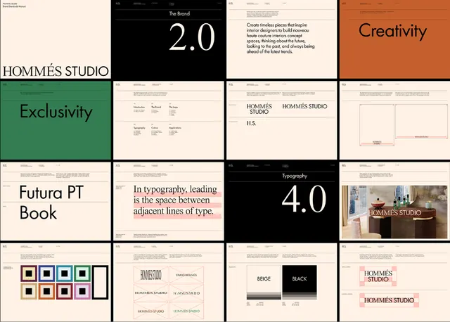
Complete brand guidelines for Hommes Studio covering logo, typography, color palette, and design applications across editorial and merchandise contexts.
Summary
Complete brand guidelines for Hommes Studio featuring a curated grid of identity materials, typography specimens, color applications, and design principles across editorial, merchandise, and communication contexts.
Visual description
A 4x4 grid of brand guideline pages for Hommes Studio. Top-left quadrant shows the studio name in a refined serif/display serif stack. Pages feature color applications including forest green and warm terracotta orange set against cream and black backgrounds. A two-page spread displays the logotype with construction guides and proportional spacing. Typography section showcases Futura PT Book and typography hierarchy principles. Color system pages present six-swatch palettes in square and rectangular blocks. Additional pages show the logo lockup, "Hommes Studio" wordmark variations, and labeled color names (Beige, Black, etc.) in organized rows. A photographic page shows an interior shot branded with the Hommes Studio logo. Overall aesthetic is studio-grade sophisticated: high-contrast pairing of black text/imagery on cream stock, secondary pages in solid color blocks.
Key takeaway
The grid layout itself as a guideline template: systematic organization of assets (logo, type, color, product shot) in a square grid tells viewers the brand is composed and intentional. The warm, sophisticated accent-color palette (forest green + burnt orange on neutrals) feels premium without being trendy. The serif/sans-serif pairing (likely Futura PT as the display serif) shows authority in editorial contexts.
Reuse notes
Ideal reference for designing studio or agency brand guidelines. The structured grid approach scales well for PDF or web presentations. Works strongest for media, publishing, or creative-services brands where a curated, editorial tone sells confidence. The color palette translates well to environmental or packaging design.
More like this







Keep what you find
A free account saves references to boards and can send you a weekly email of picks based on what you save.
To see every result, go Pro.