Preview image. Unlock full-res
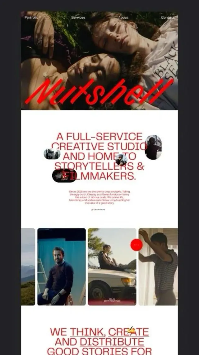
Creative studio identity combining red neon-style italic type overlaid on intimate portrait photography, supported by structured layout and circular image crops.
Summary
Creative studio branding using red neon-style italic type layered over candid portrait photography, with a structured multi-section layout presenting team photography and mission statement.
Visual description
Multi-panel editorial layout on white and dark backgrounds. Top section shows a dark photograph of people lying down with red italic neon text "leirshat" overlaid. Navigation menu (Portfolio, Services, About, Contact) sits top left in white serif type. Below, white background section presents the studio name and "A FULL-SERVICE CREATIVE STUDIO AND HOME TO STORYTELLERS & FILMMAKERS" in large red sans-serif capitals, with circular cropped portrait photographs and documentary imagery interspersed. Bottom section displays "WE THINK, CREATE AND DISTRIBUTE GOOD STORIES FOR..." in the same red typography, with three tall portrait photographs in varying crops.
Key takeaway
The neon-effect italic red type creates instant energy and brand recognition against photography. The circular portrait crops act as visual punctuation breaking the typography into readable chunks. The combination of dark moody photography with high-contrast red type and clean white space gives the layout room to breathe while maintaining impact.
Reuse notes
Well-suited for creative agencies, production studios, or any team-focused brand wanting to project confidence and human connection. The red accent works best when the supporting photography is genuinely strong. White space balance is critical; this layout would feel cramped at smaller scales.
More like this



Keep what you find
A free account saves references to boards and can send you a weekly email of picks based on what you save.
To see every result, go Pro.