Preview image. Unlock full-res
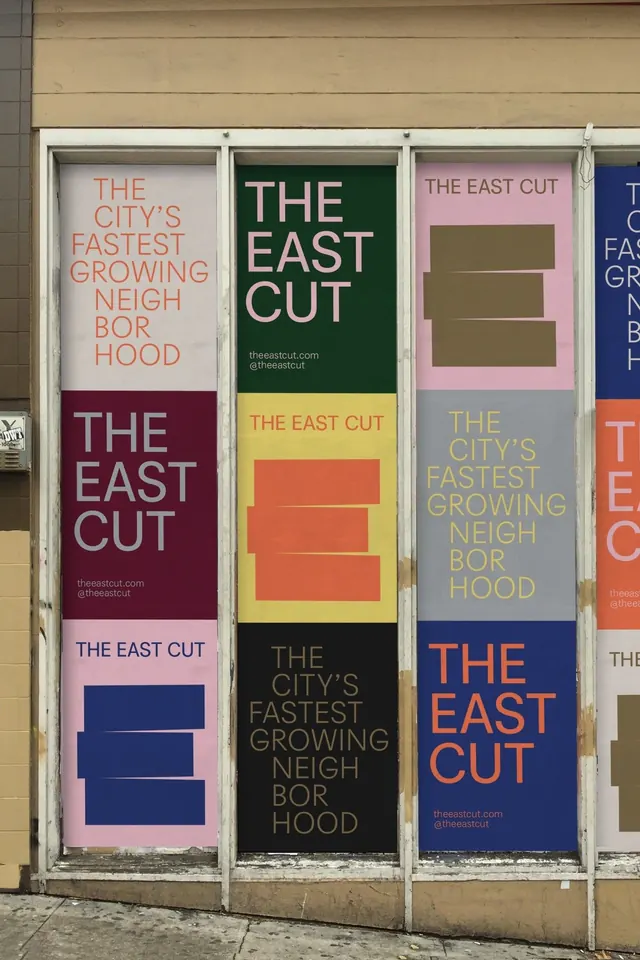
Modular poster series with stacked rectangular shapes and sans-serif type on warm, muted, and cool color backgrounds promoting a neighborhood district.
Summary
A modular neighborhood branding poster series using stacked colored rectangles as a core graphic motif, pairing them with oversized all-caps sans-serif type on solid backgrounds in warm earths, cool blues, and neutrals.
Visual description
Four vertical poster panels in a storefront window display. Each panel combines a solid background color with stacked rectangular shapes and bold all-caps typography. The panels rotate through a consistent palette: deep forest green with cream type, burgundy/wine with light type, light pink with navy rectangles, and navy with bright orange type. The rectangles appear in 2-4 stacked layers per panel, creating rhythm and visual interest. Type treatment is all-caps, serif-free, and institutional. The posters include "theeastcut.com" and "@theeastcut" attribution, identifying the subject as a neighborhood district.
Key takeaway
A durable geometric system built from stacked rectangles that works across multiple color variations. The pairing of muted, warm ground colors with cooler accents creates visual range while staying cohesive. The all-caps type treatment enforces clarity and authority.
Reuse notes
Strong for neighborhood, cultural district, or municipal branding where modularity across print materials matters. The color palette and geometric system tolerate variation without feeling chaotic. Works well at large scale (wayfinding, posters, exterior signage).
More like this





Keep what you find
A free account saves references to boards and can send you a weekly email of picks based on what you save.
To see every result, go Pro.