Preview image. Unlock full-res
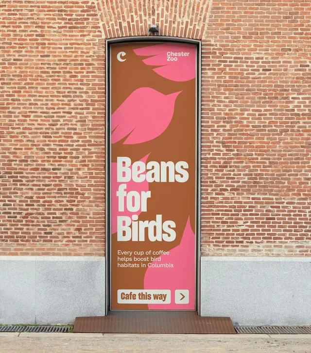
A tall brown and pink doorway graphic in a brick wall, headlined "Beans for Birds" over layered pink bird silhouettes with a directional cafe button.
More like this
See all
Summary
A full-height doorway wrap in a red brick wall that pairs a cause line, "Beans for Birds", with a wayfinding button pointing at the cafe.
Visual description
The graphic fills a tall arched-lintel doorway, shot straight on with brickwork and a grey stone plinth around it. The field is warm chestnut brown. Pink bird silhouettes in several sizes are layered across it, one large bird floating in the upper third, others cropped by the panel edges, all reading as simple pointed-beak shapes with fanned tails. Top left is the small cream crescent monogram, top right the two-line "Chester Zoo" wordmark. The headline "Beans for Birds" sits in the lower middle, three lines of heavy condensed cream display type, flush left, followed by three lines of small cream sub-copy about coffee funding bird habitats. At the bottom a cream rounded button reads "Cafe this way" in brown, with a separate square cream chip holding a brown chevron arrow beside it.
Key takeaway
The same panel does brand storytelling and wayfinding: the cause line earns the attention, the arrow button converts it into a direction. Splitting the label and the arrow into two adjacent cream chips makes the direction read as a control rather than as more copy.
Reuse notes
Reach for this on doors, columns and other tall narrow surfaces where a poster grid does not fit, especially when a message needs a call to action attached. The layered silhouettes need a low-contrast background to stay quiet behind the type. Brown and pink is an unusual pairing that will fight most photography, so keep this style to flat-color panels.