Preview image. Unlock full-res
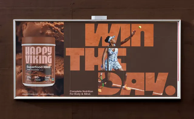
A framed billboard in tonal browns pairing a chocolate product panel with an oversized headline that a cut-out athlete steps through.
More like this
See all

Summary
A horizontal billboard split into a product panel and a headline panel, held together by a single brown and terracotta palette borrowed from the chocolate flavour it advertises.
Visual description
The poster is mounted in a slim silver lightbox frame on a dark brown vertical timber wall, with a small hood light above it. The left third is a full-bleed macro of chocolate ice cream with the brown product tub floating over it, its "HAPPY VIKING" wordmark in dusty pink, "Superfood Meal / Triple Chocolate" in white, and the usual three stat blocks. Under the tub, "DRINKHAPPYVIKING.COM" and "@DRINKHAPPYVIKING" sit in small white caps. The right two thirds is a flat dark brown field carrying "WIN THE DAY." in enormous terracotta display caps stacked over three lines with the full stop sized as a large solid circle. A cut-out photograph of a tennis player mid-serve, in a patterned blue dress with a headband and orange shoes, is placed inside the type so she reads in front of the "WIN" and "THE" strokes but behind parts of "DAY", with a small yellow ball in the air at the top right. Bottom left of the brown field, "Complete Nutrition For Body & Mind." is set small in pale pink over two lines. Paper seams and slight creasing are visible across the pasted sheet.
Key takeaway
Weaving the cut-out figure both in front of and behind the letterforms creates depth from two flat layers, and it makes the headline feel physically inhabited rather than typed over the image. Restricting the whole board to the flavour's own colour family means the product panel and the message panel look like one piece rather than two ads side by side.
Reuse notes
A useful pattern for out-of-home or wide web headers that must show a product and a short brand line at once without a hard divider. Requires a clean cut-out subject with limbs that can cross the letters, and a display face heavy enough to survive being interrupted. The tonal palette works because it comes from the product itself, so it needs to be rebuilt per flavour rather than reused as a fixed brand colourway.