Preview image. Unlock full-res
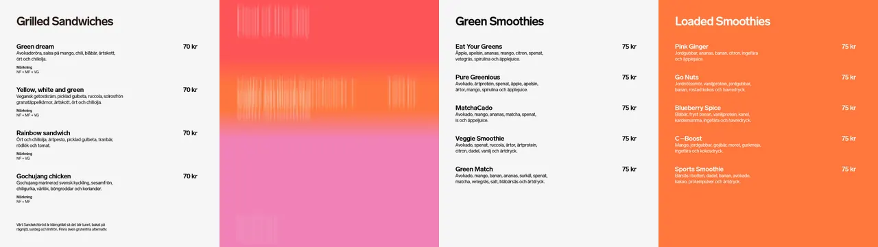
Ultra-wide menu layout of four panels, three light typographic price lists split by a blurred pink to orange gradient panel and closed by a solid orange column.
More like this
See all

Summary
A menu board split into four equal vertical panels where a single blurred color field takes the place of food photography.
Visual description
An extremely wide horizontal layout divided into four full-height panels of equal width. Panels one and three sit on near-white and carry black type: a bold category heading at the top left, "Grilled Sandwiches" and "Green Smoothies", then a list of items. Each item is a bold name on the left, a lighter one or two line ingredient description beneath, and a right aligned price in kronor on the same baseline as the name. The sandwich column adds a small grey "Markning" block with abbreviation codes under each entry and a footnote paragraph at the bottom. Panel two is entirely image: a soft vertical gradient running red at the top through orange to pink at the bottom, streaked with fine vertical smears that look like a long exposure of colored light, with no type at all. Panel four inverts the scheme, solid orange with white type in the same structure under "Loaded Smoothies". Type sits on a consistent baseline grid across all three text panels, and prices align in a single right hand column within each panel.
Key takeaway
Replacing product shots with one abstract color panel keeps the board fast to read and cheap to update, while still carrying the appetite appeal photography would have supplied. Repeating an identical name, description, price structure across panels means only the background changes between categories, so a new section is a color decision rather than a layout one.
Reuse notes
Built for a wide digital menu run or a multi-screen wall in quick service retail, and it adapts to any number of panels. White type on orange is the weakest pairing here, so check it at the actual viewing distance before adding more colored columns. The abstract panel needs to sit between text panels rather than at an end, or the run loses its rhythm.