Preview image. Unlock full-res
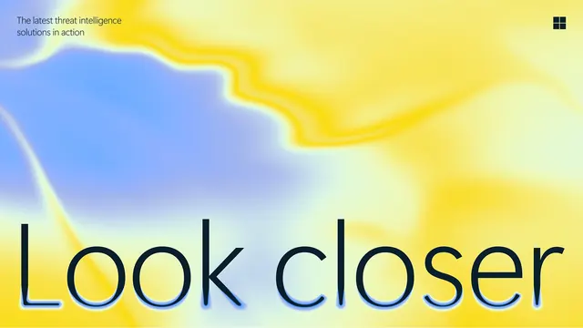
Wide campaign key visual with "Look closer" set in oversized thin lowercase across a soft yellow and periwinkle liquid gradient.
More like this
See all

Summary
A wide brand key visual where a single oversized lowercase line sits on the baseline of a soft, liquid yellow and blue gradient field.
Visual description
The full frame is a blurred gradient: warm yellow occupying the right and upper area, a cool periwinkle mass bleeding in from the left, and a pale mint seam where they meet. A sharper yellow filament runs through the middle like a folded edge, the only crisp line in an otherwise diffused field. Top left, two lines of small dark sans-serif read "The latest threat intelligence solutions in action". Top right sits a monochrome four-pane square mark in the same near-black. The words "Look closer" run across the bottom in very large, thin lowercase, cropped tight to the lower edge so the descender area is cut, with a faint blue halo glowing off the letterforms where they cross the yellow.
Key takeaway
A hairline weight at display size is what keeps an enormous headline feeling quiet, and letting the gradient bloom around the letters ties type and background into one surface instead of a layer stack. Anchoring the line to the bottom edge leaves the entire upper field free for the gradient to perform.
Reuse notes
Well suited to enterprise or security brands trying to sound reassuring rather than alarming, and to wide formats such as event backdrops or site heroes. The thin weight needs real size to survive; at small scale it disappears against a busy gradient. Contrast of the top-left sub-copy against yellow is only just adequate, so check accessibility before reusing the tone pairing.
More like this

Keep what you find
A free account saves references to boards and can send you a weekly email of picks based on what you save.
To see every result, go Pro.