Preview image. Unlock full-res
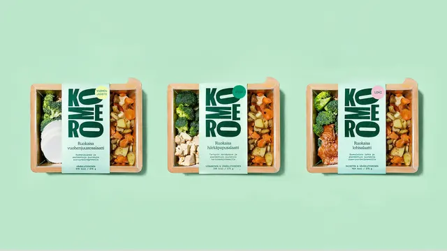
Three identical kraft salad trays in a row on mint green, separated only by the colour of the dot badge on each sleeve.
More like this
See all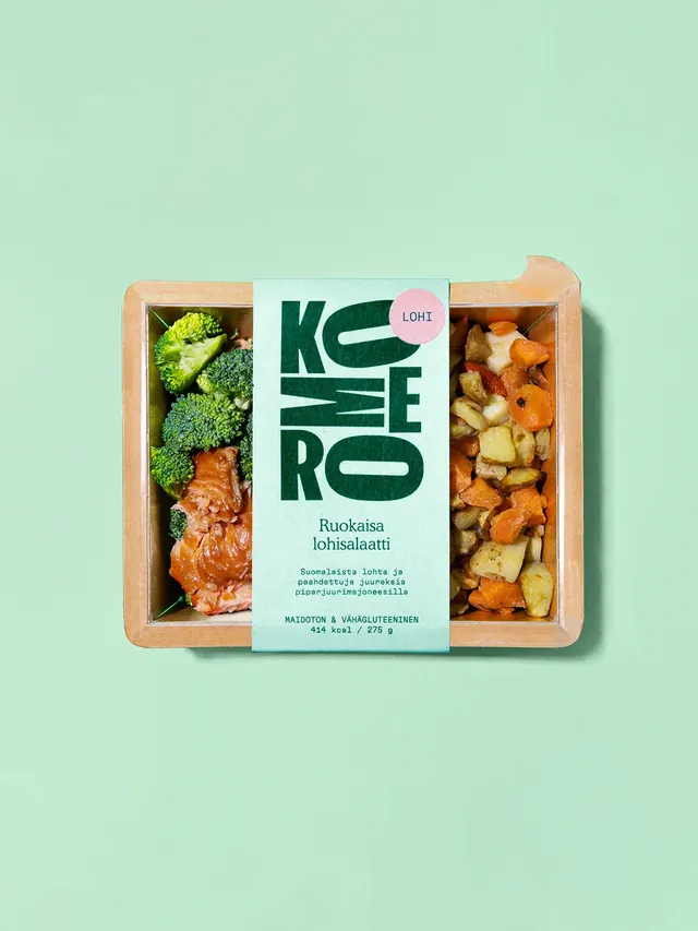


Summary
The variant system laid out in one frame: three trays, one layout, three dot colours doing all the differentiating.
Visual description
Three kraft salad trays with clear lids are spaced evenly across a soft mint green field, all shot flat from above with matching soft shadows falling downward. Each carries the same pale mint vertical paper sleeve down its centre with the stacked condensed dark green wordmark at the top, a two-line product name, three lines of small descriptive copy and a monospaced all-caps dietary and calorie block at the foot. The only differences are the dot overlapping the top right of each wordmark and the food either side of the sleeve: a pale yellow dot with a goat cheese call-out over a white cheese round and roast roots, a mint green dot with a vegetarian call-out over broccoli and cubed tofu, and a pink dot with a fish call-out over broccoli and glazed salmon. All three trays share the same rounded notch in the top right corner and the same generous margin of empty background above and below.
Key takeaway
Holding the layout completely fixed and changing only one small coloured dot is the cheapest possible variant system, and the range shot proves it by showing the three packs side by side with nothing else moving. The wide empty background above and below turns three packs into a deliberate composition rather than a product line-up.
Reuse notes
Use as the range or system frame in a packaging case study, the one that shows the rule instead of the individual pack. It needs at least three variants to make the point, and the dot colours have to be distinct at thumbnail size. The horizontal band composition also crops well to a wide web hero.